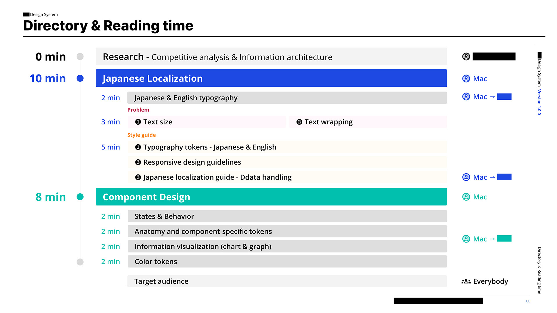
This is a demo of a business-oriented design system optimized for the Japanese market, where I am in charge of Japanese Localization, Design Tokens, Responsive design guidelines, Component Design, and Usability tests.
こちらは、日本市場向けに最適化されたビジネス志向のデザインシステムで、私は日本語ローカリゼーション、デザイントークン、レスポンシブデザインガイドライン、コンポーネントデザイン、ユーザビリティテストを担当してる。
Project Affiliation: Hays Japan
Role Description:
・Produce scenarios, user flows, wireframes, and prototypes that translate an understanding of user and business needs into intuitive user experiences.
・Effectively communicate ideas to stakeholders using evidence such as research data, user feedback, usability guidelines, and best practices.
・Support team leads to identify measures to calculate impact and achievement by selecting and applying effective UX metrics that align with the product’s Key Performance Indicators.
・Contribute to the structure and building of the KIT Design System.
プロジェクト所属:ヘイズ・ジャパン
役割説明:
• ユーザーやビジネスのニーズを理解し、それを直感的なユーザー体験に変えるシナリオ、ユーザーフロー、ワイヤーフレーム、プロトタイプを作成する。
• リサーチデータやユーザーフィードバック、ベストプラクティスを用いて、ステークホルダーに効果的にアイデアを伝える。
• チームリーダーをサポートし、KPIに沿った効果的なUX指標を選定し、成果を測定する。
• KITデザインシステムの構築と運用に貢献する。
• リサーチデータやユーザーフィードバック、ベストプラクティスを用いて、ステークホルダーに効果的にアイデアを伝える。
• チームリーダーをサポートし、KPIに沿った効果的なUX指標を選定し、成果を測定する。
• KITデザインシステムの構築と運用に貢献する。
Japanese localization
日本のローカリゼーション

The USP of this design system is Japanese localization suggests using fonts like Open Sans and Noto Sans Japanese, with proper text size, spacing, and word wrapping for readability. It also highlights the importance of following Japan’s unique date, time, and address formats and the correct order for Japanese prefectures. The goal is to improve usability by adapting designs to fit local standards.
このデザインシステムのUSPは、日本のローカリゼーションで、Open SansやNoto Sans Japaneseなどのフォントを使い、可読性のために適切な文字サイズ、間隔、改行を提案する。日本独自の日付、時間、住所の形式と、日本の都道府県の正しい順序に従う重要性も強調する。目標は、ローカルの基準に合わせてデザインを適応させることで、使いやすさを向上させることだ。
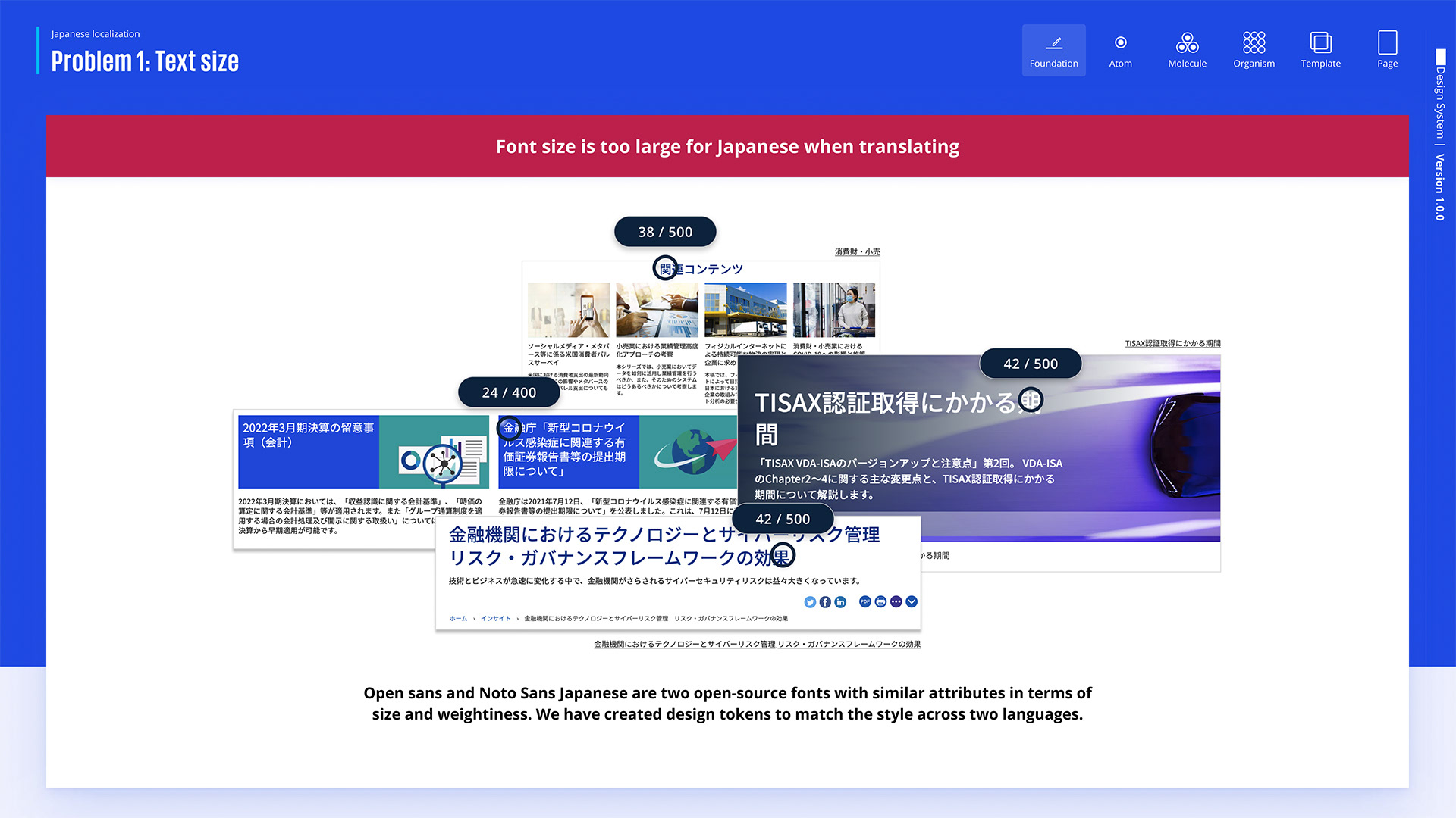
The first problem with text size in Japanese localization is that when translating English to Japanese, the font style applied to the page is too large for Japanese characters, leading to poor readability and layout issues.
日本のローカリゼーションに関する最初の問題は、英語から日本語に翻訳する時に、ページに適用されるフォントスタイルが日本語の文字には大きすぎて、可読性が下がり、レイアウトの問題が出てくることだ。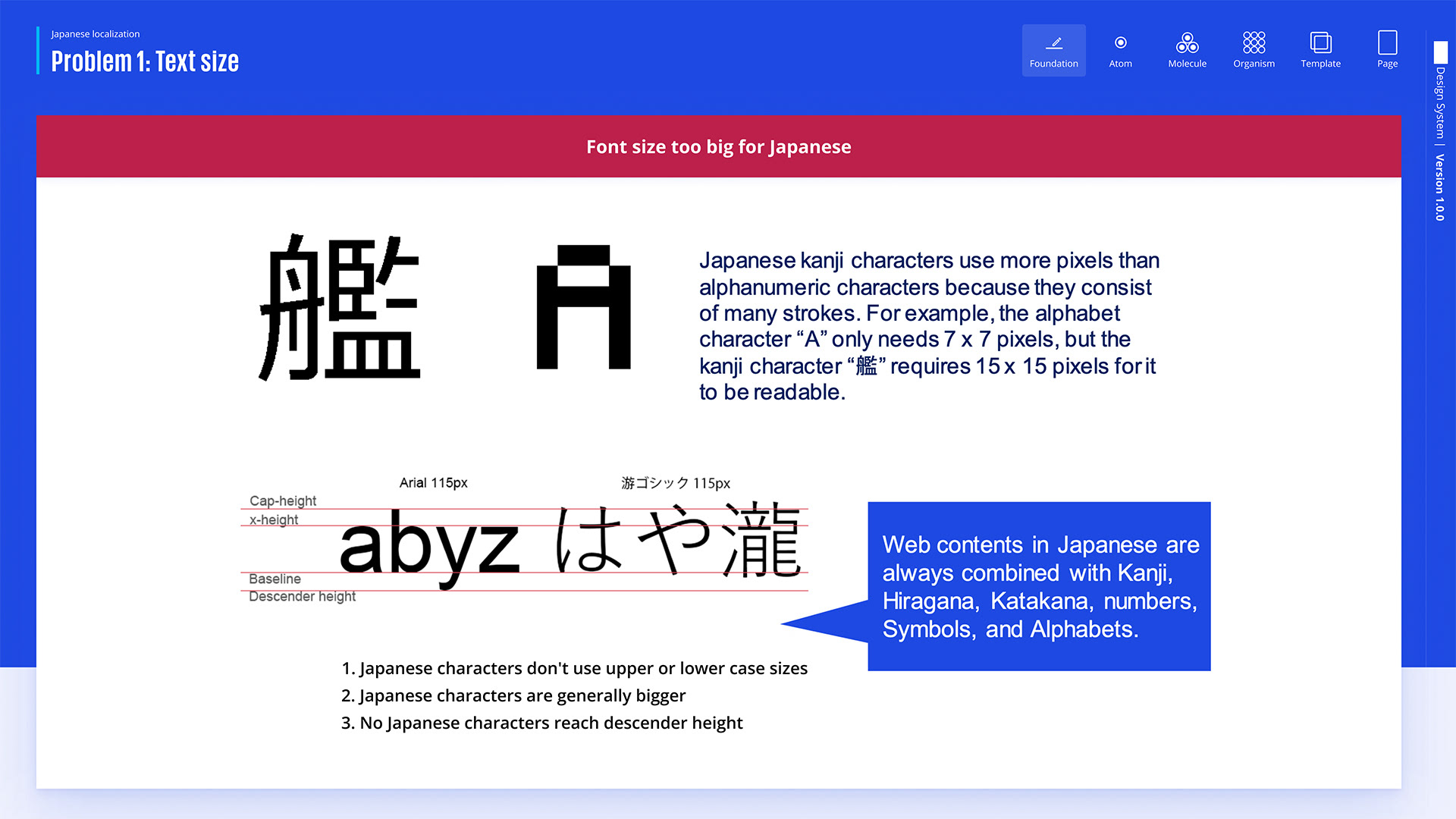
Japanese kanji require more pixels due to their complex strokes. For instance, “A” needs 7x7 pixels, but “艦” needs 15x15. Japanese characters are generally larger, with no upper or lower case, and don’t reach descender height. Japanese web content combines Kanji, Hiragana, Katakana, numbers, symbols, and alphabets.
日本の漢字は複雑な筆画のため、もっと多くのピクセルが必要だ。例えば、「A」は7x7ピクセルだけど、「艦」は15x15ピクセルが必要。日本の文字は一般的に大きくて、大文字や小文字がなく、下の高さにも達しない。日本のウェブコンテンツは漢字、ひらがな、カタカナ、数字、記号、アルファベットを組み合わせてる。
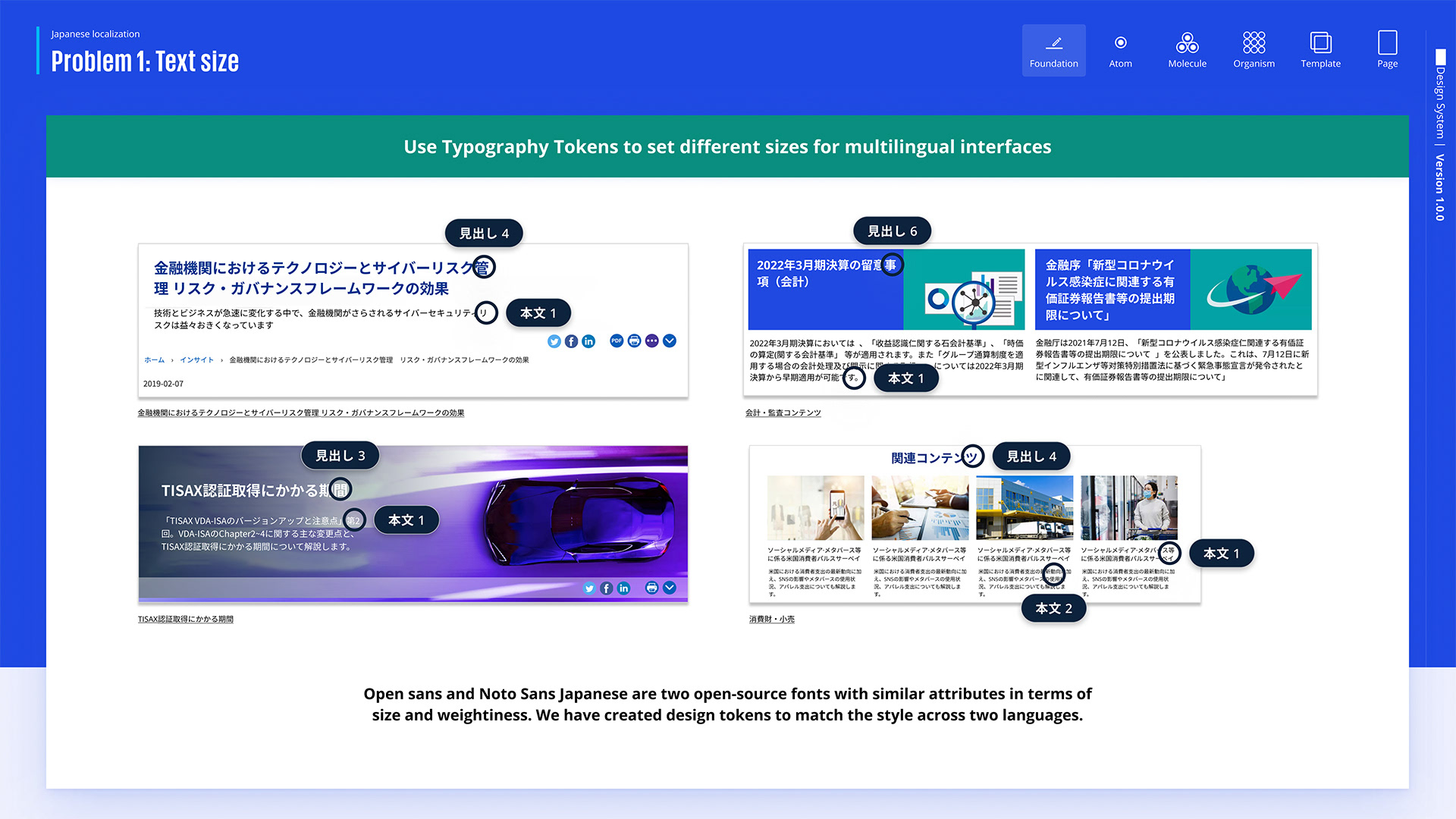
The solution to the text size issue is to use typography tokens, which ensure appropriate font sizes and consistent styling across different text elements for better readability in Japanese.
テキストサイズの問題の解決策は、タイポグラフィトークンを使って、日本語の可読性を上げるために、異なるテキスト要素に対して適切なフォントサイズと一貫したスタイリングを確保することだ。Typography Tokens
タイポグラフィトークン
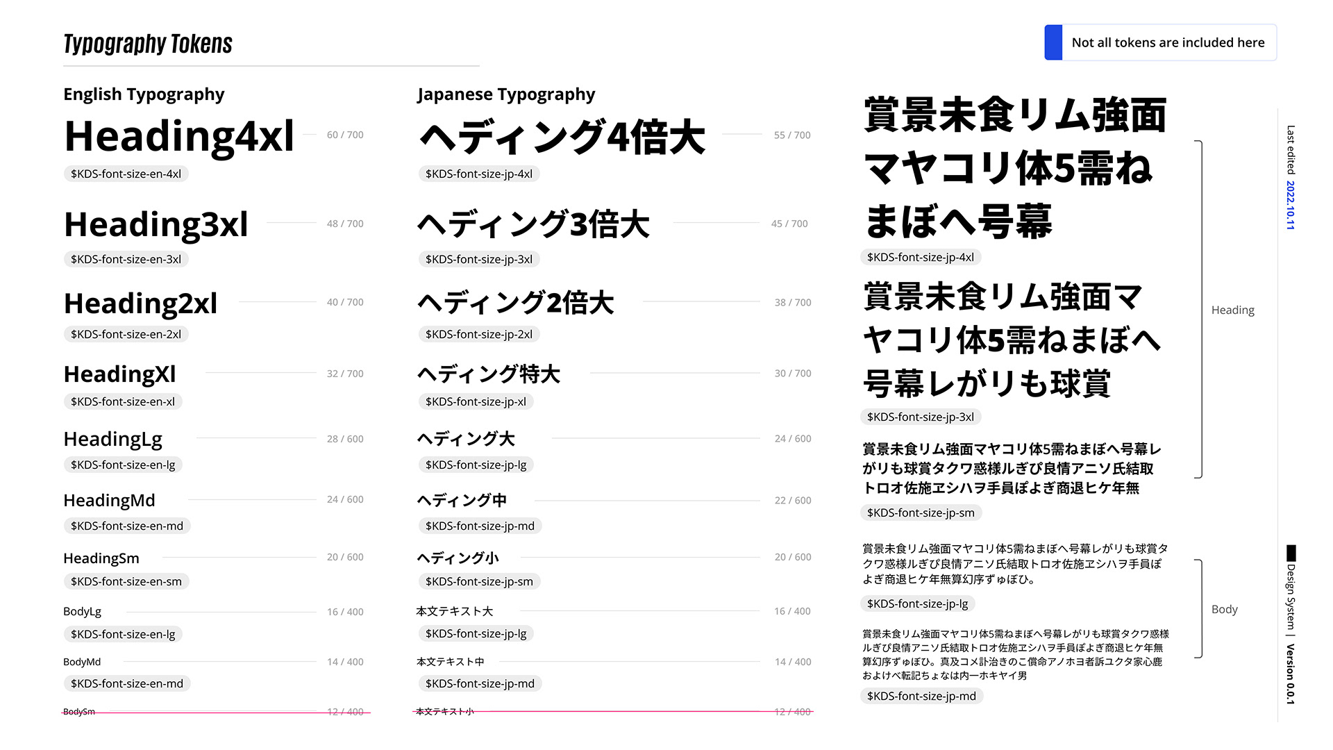
The slide compares English and Japanese typography tokens for various heading and body text sizes, demonstrating the consistent application of design tokens across both languages. Additionally, we have removed font sizes under 14 for improved readability.
このスライドは、いろんな見出しや本文のテキストサイズに関する英語と日本語のタイポグラフィトークンを比べて、両方の言語でデザイントークンが一貫して使われているのを示してる。さらに、可読性を上げるために、14未満のフォントサイズを削除した。
Text wrapping
テキストの折り返し
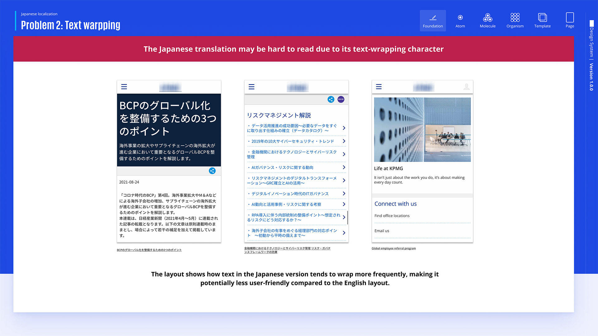
The Japanese text wraps more frequently than English and often splits a single word, making the layout harder to read and less user-friendly.
日本語のテキストは英語よりもよく折り返して、単語が分かれることが多いから、レイアウトが読みづらくなって、ユーザーフレンドリーさが下がってる。
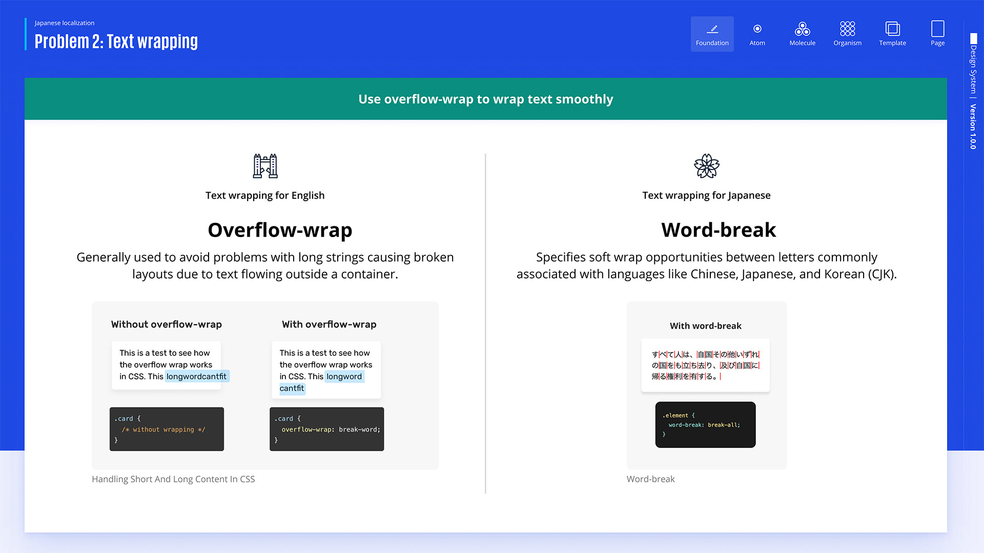
The issue of text splitting in the middle is addressed by using overflow-wrap for Japanese, preventing broken layouts caused by long strings, and word-break for English, which provides soft wrap opportunities for smoother text flow in languages like Chinese, Japanese, and Korean (CJK).
テキストが途中で分かれる問題は、日本語にはoverflow-wrapを使って、長い文字列でレイアウトが崩れるのを防いでる。英語にはword-breakを使って、テキストの流れをスムーズにするために、中国語、日本語、韓国語(CJK)みたいな言語でソフトラップの機会を提供してる。

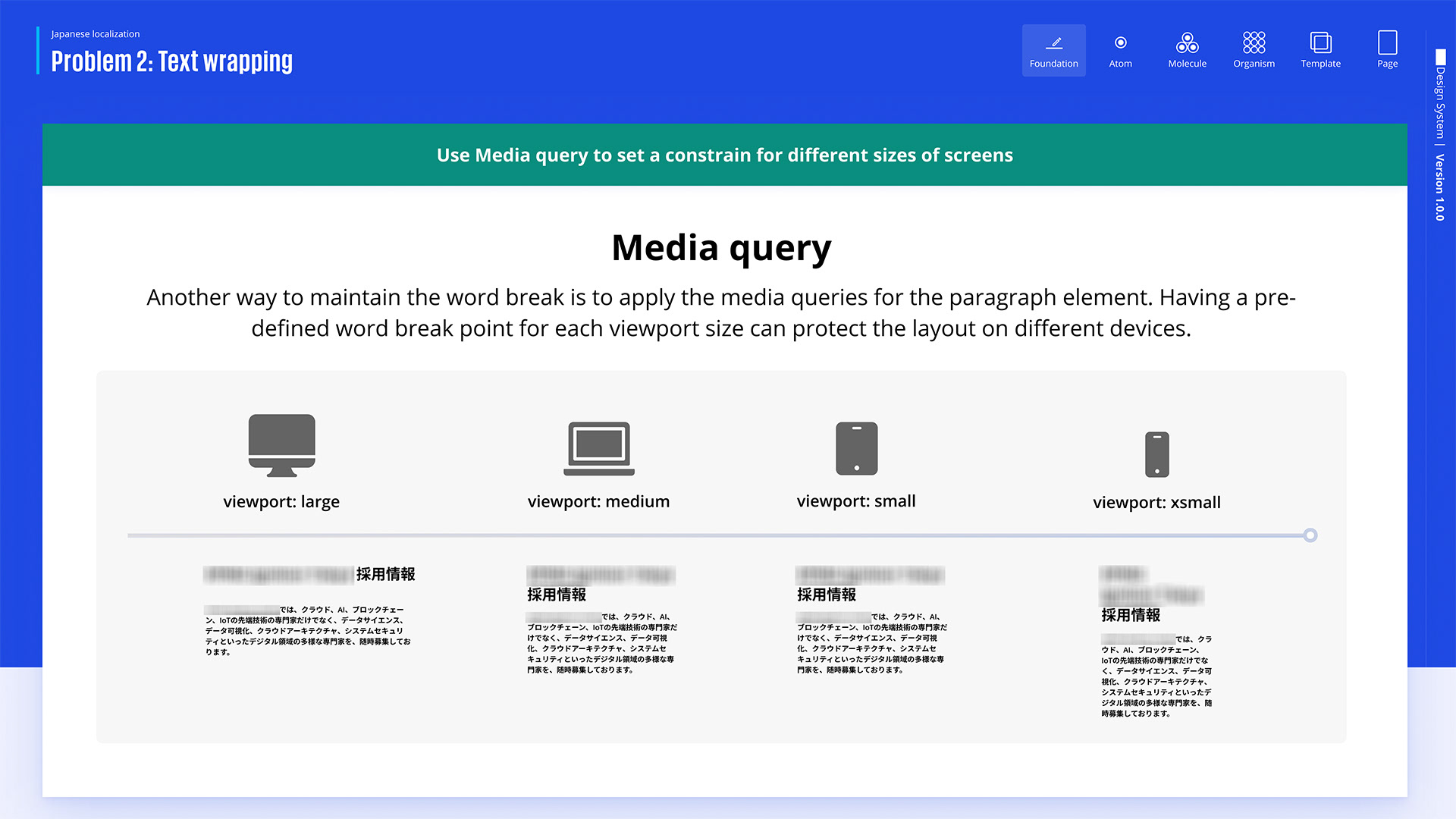
The future solution would be using media queries to manage text wrapping across different screen sizes, ensuring that word breaks are pre-defined based on the viewport to maintain a consistent layout on various devices.
将来の解決策は、メディアクエリを使って異なる画面サイズでのテキストの折り返しを管理して、単語の分割をビューポートに基づいてあらかじめ決めることで、いろんなデバイスで一貫したレイアウトを保つことだ。
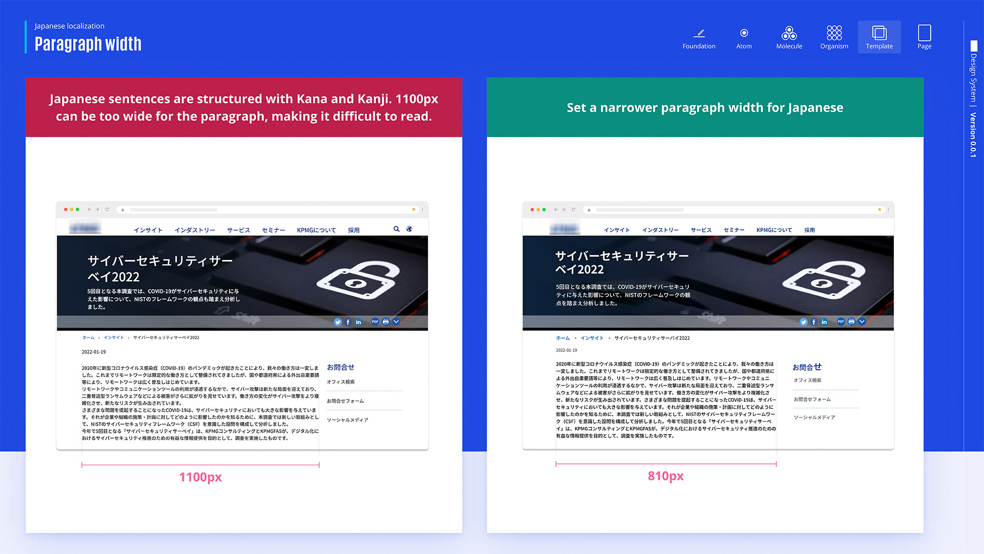
Since Japanese sentences are composed of Kana and Kanji, they can be challenging to read when the paragraph width is too wide, such as 1100px. The recommended solution is to use a narrower width, like 810px, to improve readability. This adjustment makes the text easier to follow, ensuring a better reading experience in Japanese.
日本語の文は仮名と漢字で構成されているから、段落の幅が1100pxのように広すぎると、読みづらくなる。推奨される解決策は、可読性を向上させるために、810pxのように幅を狭くすることだ。この調整により、テキストが追いやすくなり、日本語の読みやすい体験が確保される。
Responsive Design
レスポンシブデザイン
Another future solution we have proposed is adjusting margins, which will make the layout cleaner and the text more readable while ensuring proper spacing and preventing text from being too close to the screen edges.
私たちが提案したもう一つの将来の解決策は、マージンを調整することで、レイアウトをもっとクリーンにして、テキストの読みやすさを上げることだ。これで、適切なスペースを確保して、テキストが画面の端に近すぎないようにする。
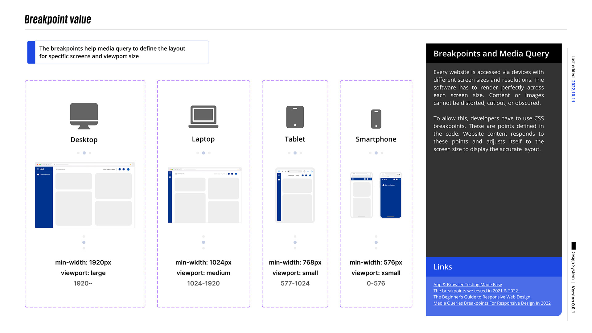
Setting these breakpoints enables the Media Query to adapt efficiently; we have decided on a range of breakpoints to trigger different layouts on various screen sizes.
これらのブレークポイントを設定することで、メディアクエリが効率的に適応できるようになる。いろんな画面サイズで異なるレイアウトをトリガーするために、一連のブレークポイントを決めた。Implementation sample
実装サンプル
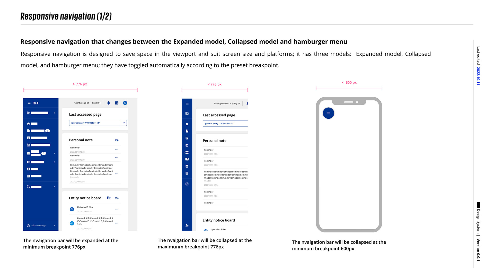
By establishing a Media Query, we can design a separate state for different screen sizes. To save space, in this version, we designed the collapse specification for the navigation bar and implemented it in the Tax-related application.
Media Queryを作成することで、異なる画面サイズに合わせた別々の状態をデザインすることができる。このバージョンでは、スペースを節約するためにナビゲーションバーの折りたたみ仕様をデザインし、Tax関連のアプリケーションに実装した。

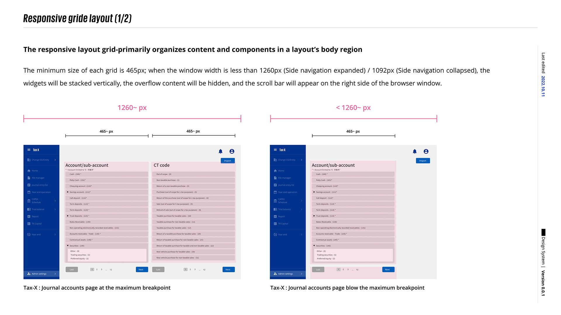
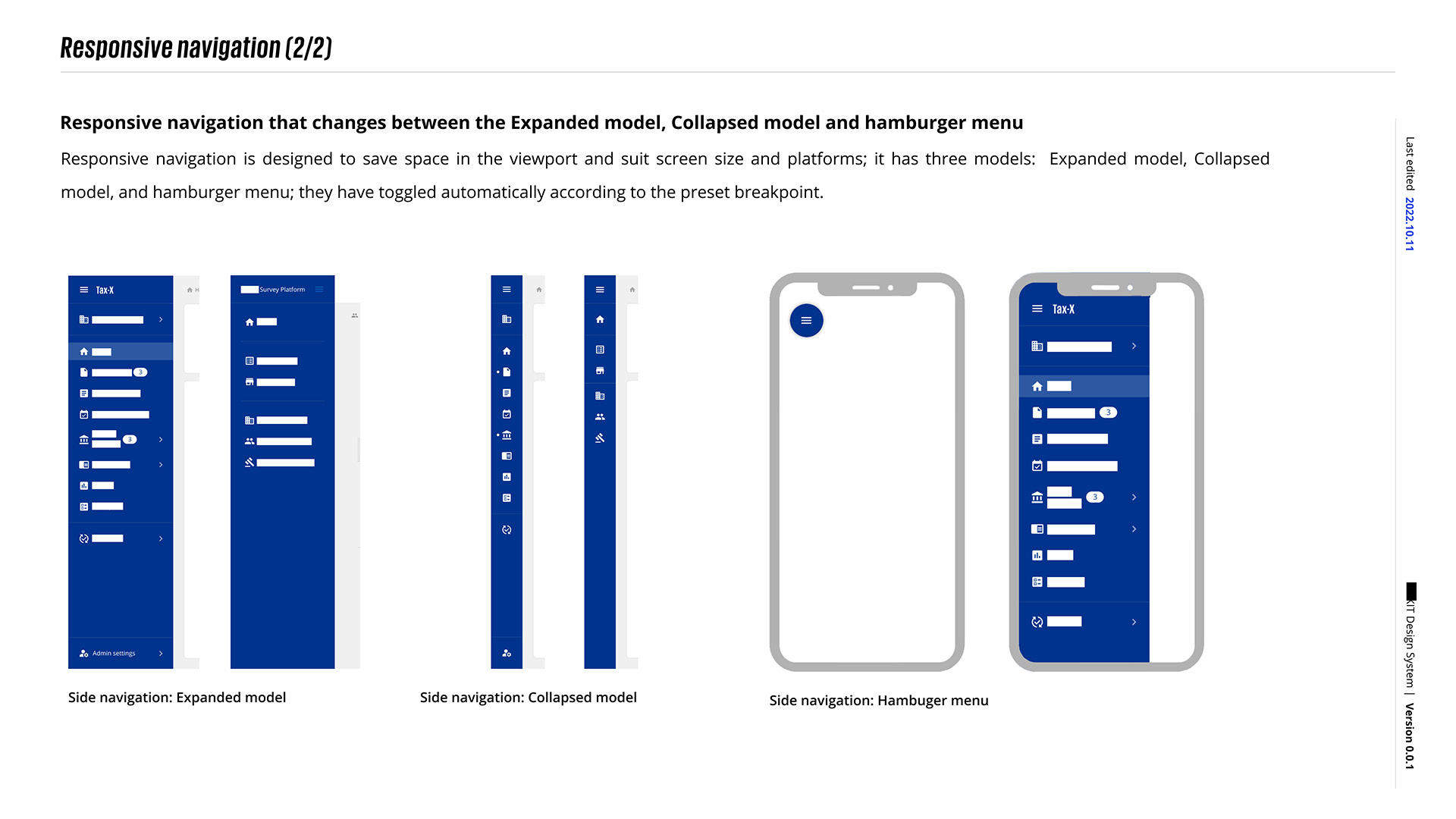
In this version, we also worked with the development team to implement component wrapping. When the browser size triggers the media query, we can wrap the components. We believe this is a significant improvement over past business applications.
このバージョンでは、開発チームと協力してコンポーネントの折り返しを実装した。ブラウザのサイズがメディアクエリを発動すると、コンポーネントを折り返すことができる。これは過去のビジネスアプリケーションにとって大きな改善だと思ってる。
Order of list item
リスト項目の順序
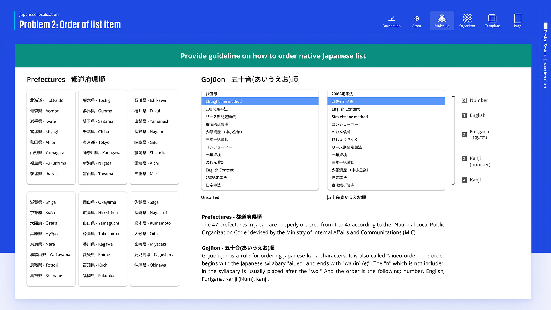
The 47 Japanese prefectures are arranged in a standardized order from 1 to 47 based on the National Local Public Organization Code established by Japan’s Ministry of Internal Affairs and Communications (MIC). The Gojūon order, a traditional method of arranging Japanese kana characters in the a-i-u-e-o syllabary, starts with “あ” (a) and ends with “わ” (wa) and “ん” (n). Characters can also be organized by numbers, English, Furigana (phonetic reading of Kanji), or Kanji.
日本の47都道府県は、日本の総務省によって制定された国家地方公共組織法に基づいて、1から47の標準的な順序で配置される。五十音順は、日本の仮名文字をあ-い-う-え-お音節で配置する伝統的な方法で、最初は「あ」(a)から始まり、最後は「わ」(wa)と「ん」(n)で終わる。文字はまた、数字、英語、振り仮名(漢字の読み)や漢字自体などのカテゴリによって整理することもできる。Date & time format
日付と時間の形式
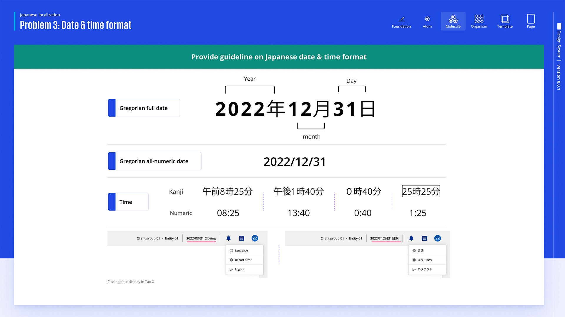
In Japan, dates are written as Year/Month/Day with kanji (e.g., 2022年12月31日), while internationally, it’s often Month/Day/Year or Day/Month/Year. For time, Japan uses kanji for AM/PM and sometimes shows hours beyond 24 (like “25:25”). International formats typically use a 12-hour or 24-hour clock without kanji. These differences highlight the need for localization when designing for Japanese users.
日本では、日付は年/月/日の形式で漢字を使って書かれる(例:2022年12月31日)。国際的には、通常、月/日/年または日/月/年の形式が使われる。時間については、日本ではAM/PMを漢字で表記し、時には24時間を超える時間(例えば「25:25」)が表示されることもある。国際的な形式では、通常、漢字なしで12時間または24時間制の時計が使われる。これらの違いは、日本のユーザー向けにデザインする際のローカリゼーションの必要性を強調する。
Address format
住所の形式
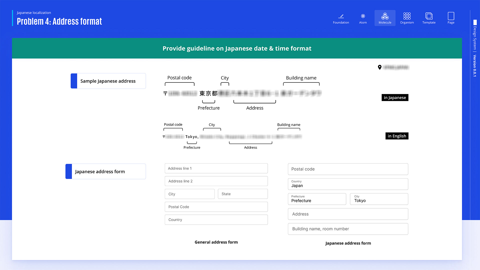
On the other hand, addresses in Japan are typically written starting from the postal code, followed by the prefecture, city, district, and then the specific building name and number. The order is reversed in English, where addresses begin with smaller details (like buildings and streets) and end with the city and country. The image also compares how a form layout should adjust to fit these different address formats, emphasizing the need for localization when designing address input forms for global users.
一方、日本の住所は通常、郵便番号から始まり、都道府県、市、区、具体的な建物名と番号が続く。英語ではこの順序が逆で、住所は小さな詳細(建物や通りなど)から始まり、最後に市や国が書かれる。この画像は、異なる住所形式に合わせてフォームレイアウトがどう調整されるべきかを比較していて、グローバルユーザー向けに住所入力フォームを設計する際のローカリゼーションの必要性を強調する。
Component Design
コンポーネントデザイン
(Sample)
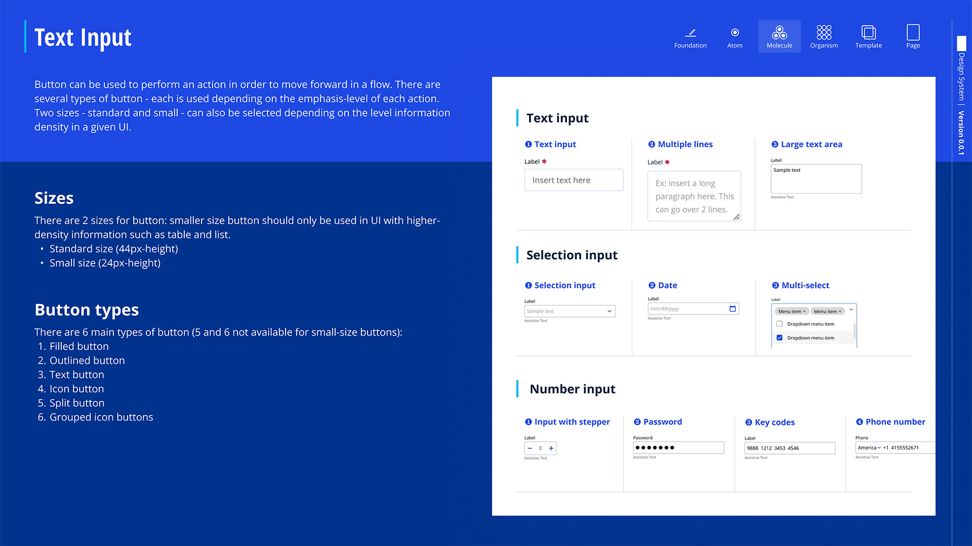
The design system contains various components, such as text and selection inputs, along with button sizes and types, including standard and small sizes based on UI needs. Its main purpose is to align with the brand image and meet business requirements.
デザインシステムには、テキストや選択入力などのいろいろなコンポーネントと、UIのニーズに基づく標準サイズと小サイズのボタンのサイズやタイプが含まれている。その主な目的は、ブランドイメージと一致させ、ビジネス要件を満たすことだ。
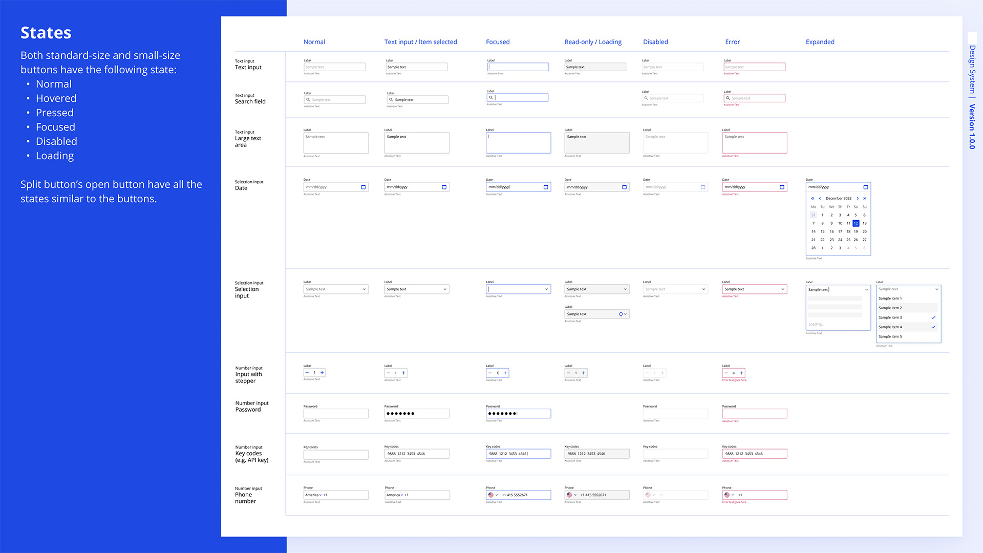
Both standard-size and small-size buttons feature the following states: Normal, Hovered, Pressed, Focused, Disabled, and Loading. Additionally, the open button of the split button includes all the same states as the regular buttons.
標準サイズと小サイズのボタンには、次の状態がある:通常、ホバー、押下、フォーカス、無効、ローディング。スプリットボタンのオープンボタンも、通常のボタンと同じすべての状態がある。
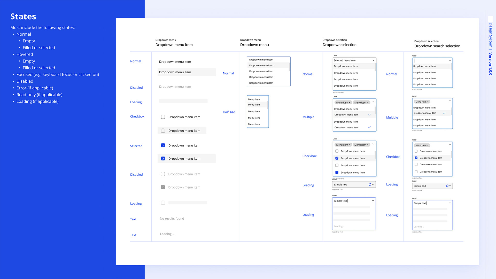
The dropdown component also has detailed states like normal, hovered, focused, disabled, loading, and selected. It includes single-selection, multiple-selection, checkbox, and searchable dropdowns, ensuring clear interactions for various use cases, such as selecting items or searching within options.
ドロップダウンコンポーネントには、通常、ホバー、フォーカス、無効、ローディング、選択された状態の詳細な状態がある。これには、単一選択、多重選択、チェックボックス、検索可能なドロップダウンが含まれていて、アイテムの選択やオプション内での検索など、いろいろなユースケースに対して明確なインタラクションを保証する。
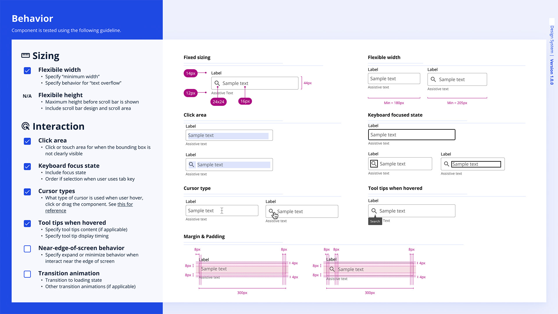
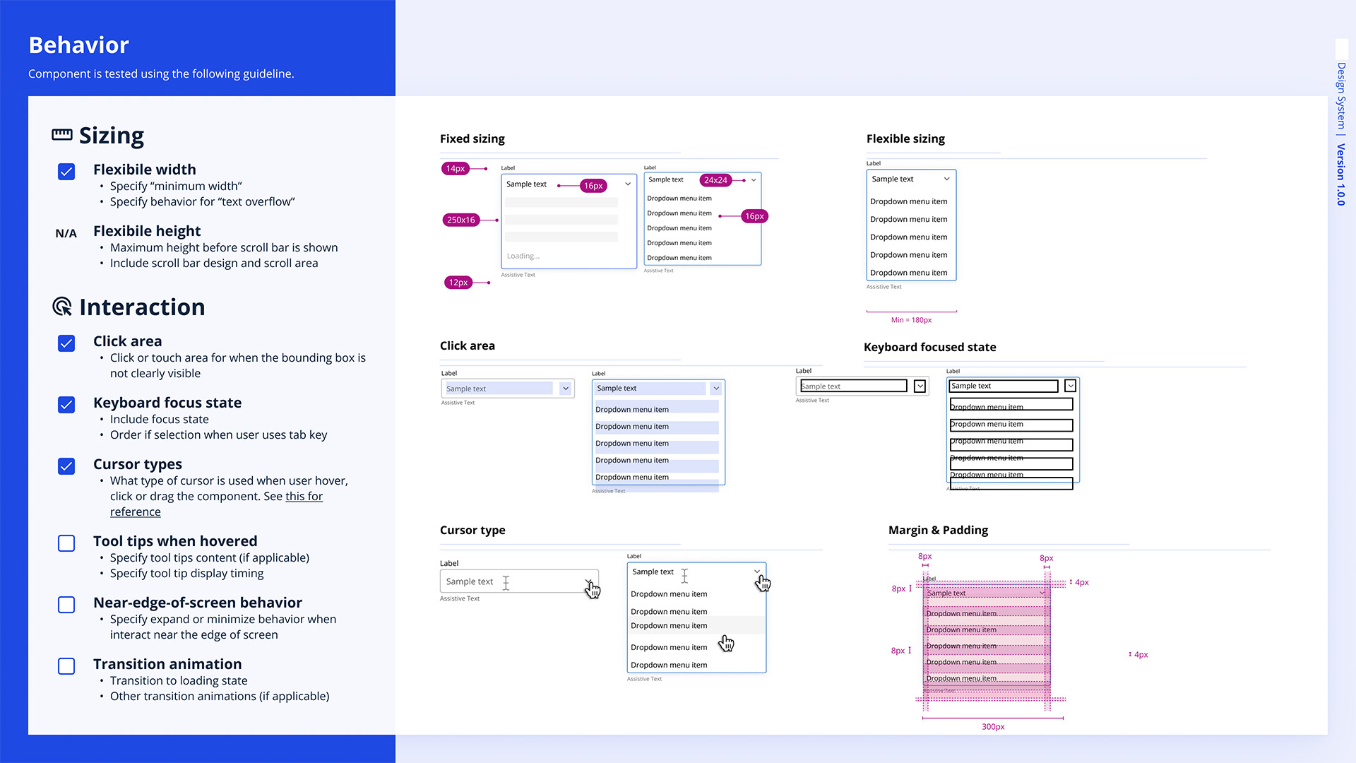
The component’s behavior includes flexible width, fixed sizing, clear click areas, and focus states for keyboard navigation. It adjusts cursor types during interactions, shows tooltips on hover, and manages screen-edge behavior with expand/minimize options. Transition animations are also applied as needed.
コンポーネントの動作には、柔軟な幅、固定サイズ、明確なクリックエリア、キーボードナビゲーション用のフォーカス状態がある。インタラクション中にカーソルの種類を調整して、ホバー時にツールチップを表示し、画面の端の動作を管理して展開/最小化オプションを提供する。また、必要に応じてトランジションアニメーションも適用される。
Anatomy and Component-specific tokens
コンポーネント分解と特有のトークン
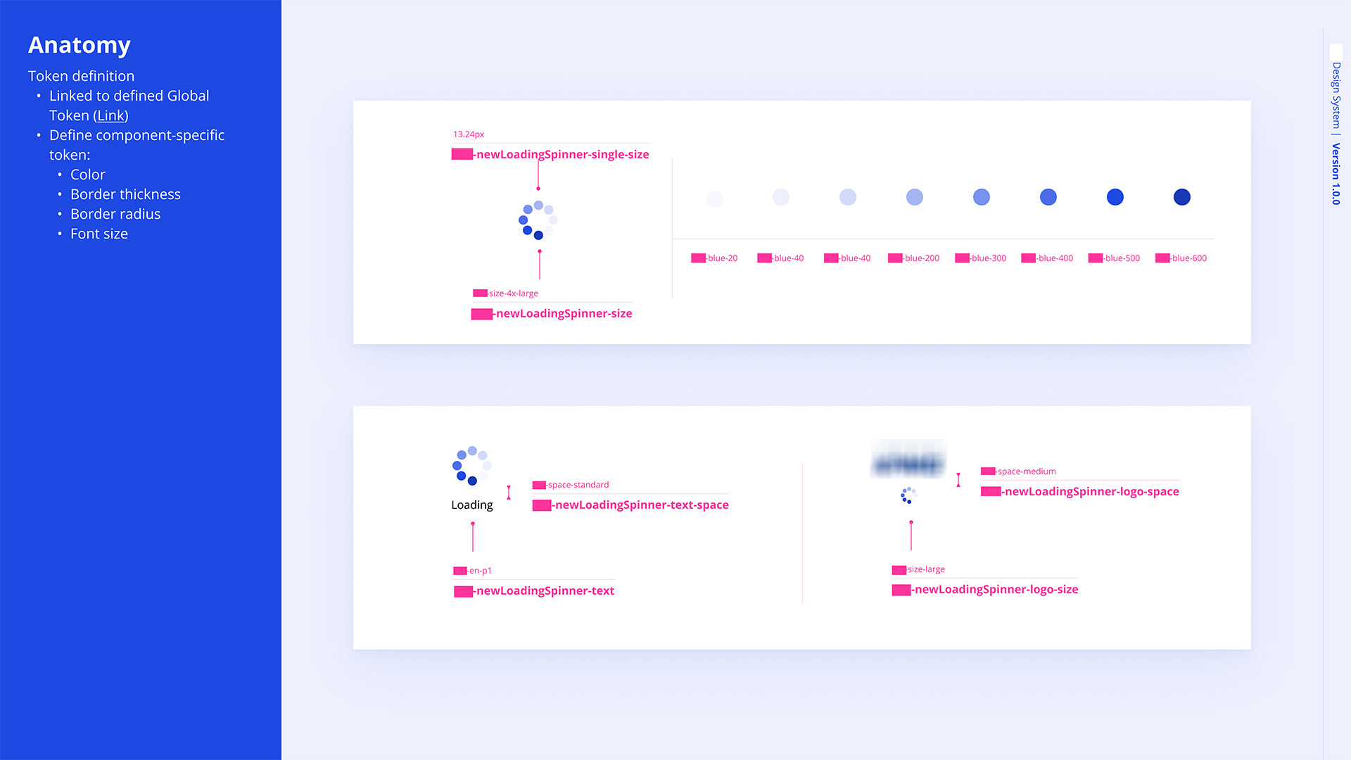
In component design, anatomy refers to the structure and organization of a UI component, broken down into individual parts or tokens. These tokens define attributes like color, size, border radius, font size, and spacing to ensure consistency across the design system. Each component combines these defined tokens, allowing flexibility while maintaining visual harmony throughout the UI.
コンポーネントデザインで、解剖学はUIコンポーネントの構造と組織を指し、個々の部分やトークンに分解される。これらのトークンは、色、サイズ、ボーダー半径、フォントサイズ、間隔などの属性を定義して、デザインシステム全体の一貫性を確保する。各コンポーネントは、これらの定義されたトークンを組み合わせて、視覚的な調和を保ちながら柔軟性を提供する。
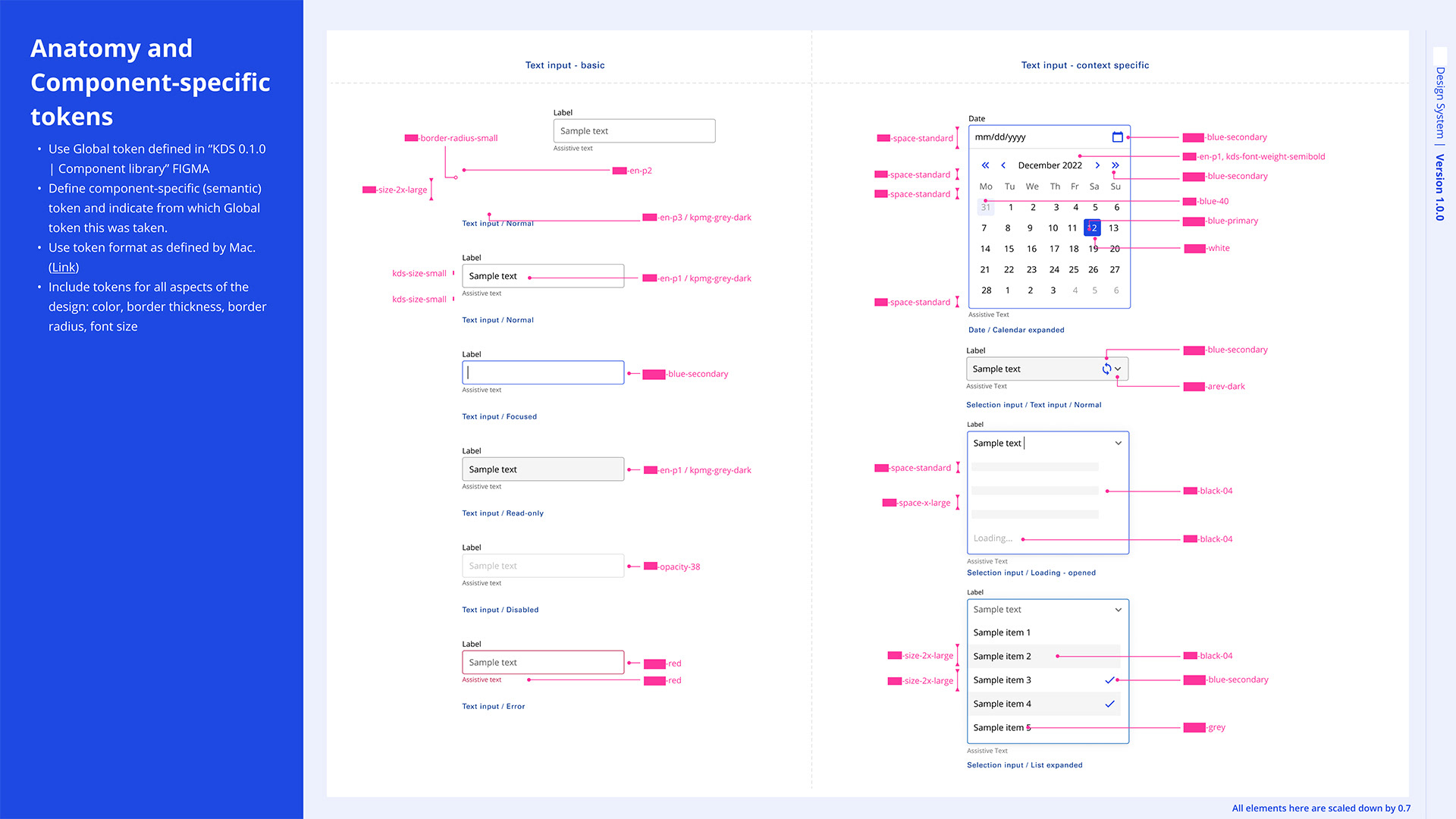
Component-specific tokens are unique values assigned to individual components to define their appearance and behavior. These tokens are derived from global tokens but are tailored to suit the specific needs of each component, ensuring consistency and flexibility. They control attributes like color, border thickness, border radius, font size, and spacing.
コンポーネント特有のトークンは、個々のコンポーネントに割り当てられたユニークな値で、その外観や動作を定義する。これらのトークンは、グローバルトークンから派生していて、各コンポーネントの特定のニーズに合わせて調整され、一貫性と柔軟性を確保する。これらは、色、ボーダーの厚さ、ボーダー半径、フォントサイズ、間隔などの属性を制御する。
Information visualization (chart & graph)
信息可视化(图表和图形)
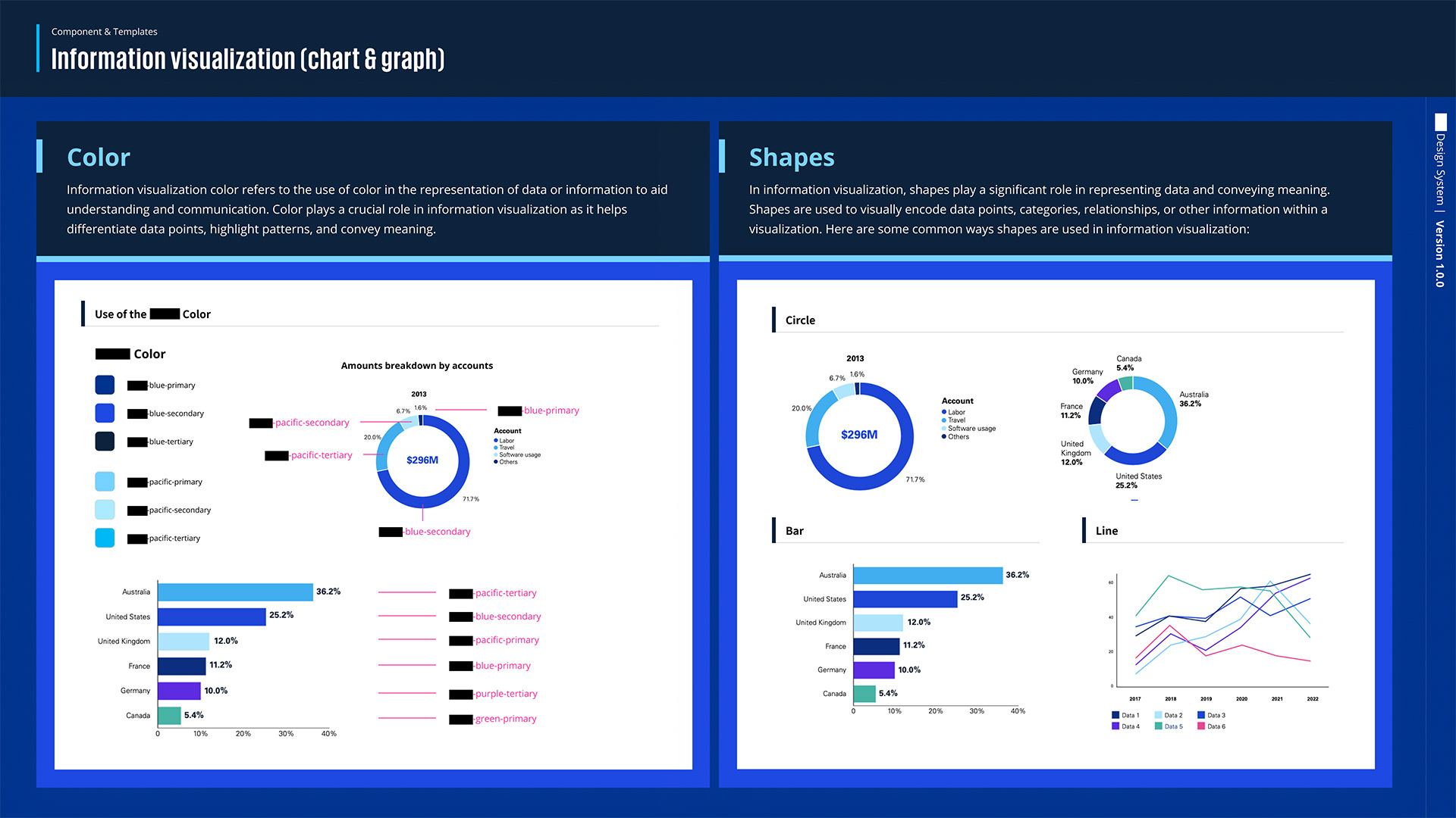
The information visualization part highlights the use of color and shapes in data visualization. Color helps differentiate data points, using primary brand colors to represent categories and regions. Shapes like circles, bars, and lines are used for proportions, comparisons, and trends. Together, they create clear and effective visualizations for better data understanding.
情報視覚化の部分では、データ視覚化における色と形の使用が強調される。色はデータポイントを区別するのに役立ち、プライマリーブランドカラーを使ってカテゴリや地域を表現する。円、バー、線などの形は、割合、比較、トレンドを示すために使われる。これらは一緒に、データ理解を深めるための明確で効果的な視覚化を作り出す。

The slide shows a color palette for infographics and charts, with dark blues, light blues, purples, pinks, greens, and neutrals. Key colors include different shades of blue, purple, pink, green, and gray. Dotted colors are used only in charts, and neutral tones help highlight and separate content, ensuring a clear and consistent visual style.
このスライドは、インフォグラフィックやチャート用のカラーパレットを示していて、ダークブルー、ライトブルー、パープル、ピンク、グリーン、ニュートラルがある。主要な色には、いろんな青、紫、ピンク、緑、グレーのシェードが含まれてる。点線の色はチャートにだけ使われて、ニュートラルなトーンはコンテンツを強調して分けるのに役立って、明確で一貫したビジュアルスタイルを保ってる。
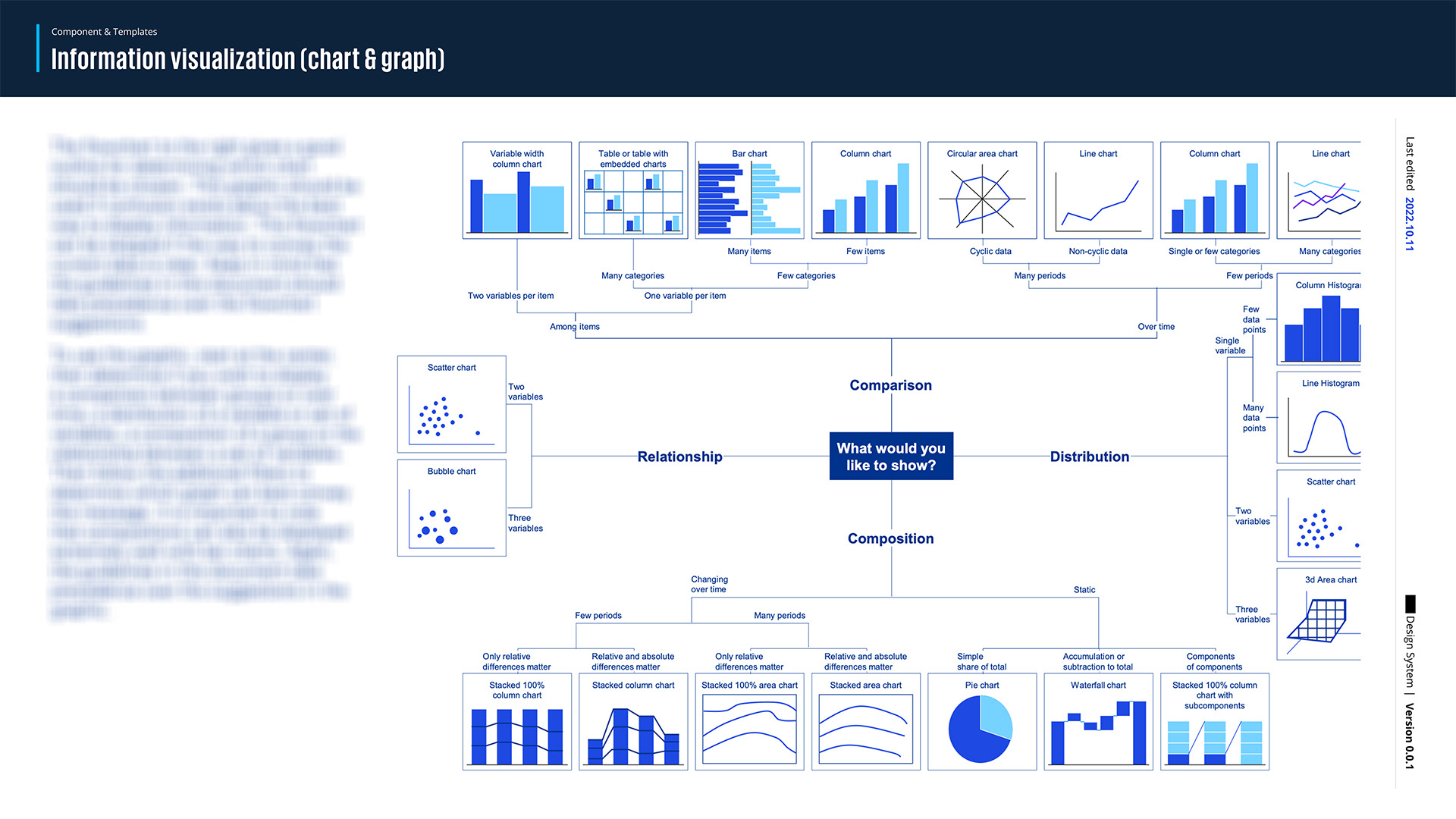
Depending on your data type, such as the number of variables, items, categories, or time periods, the flowchart suggests different chart types like bar charts, column charts, scatter charts, line charts, pie charts, and more. The guidelines in the document take precedence over the flowchart, and it’s useful when deciding between various data visualization options.
データの種類、例えば変数の数、アイテム、カテゴリ、または期間によって、フローチャートは棒グラフ、カラムチャート、散布図、折れ線グラフ、円グラフなどのいろんなチャートタイプを提案してる。この文書のガイドラインがフローチャートより優先されて、いろんなデータビジュアライゼーションの選択を決める時に役立つ。
Color Tokens
カラー トークン
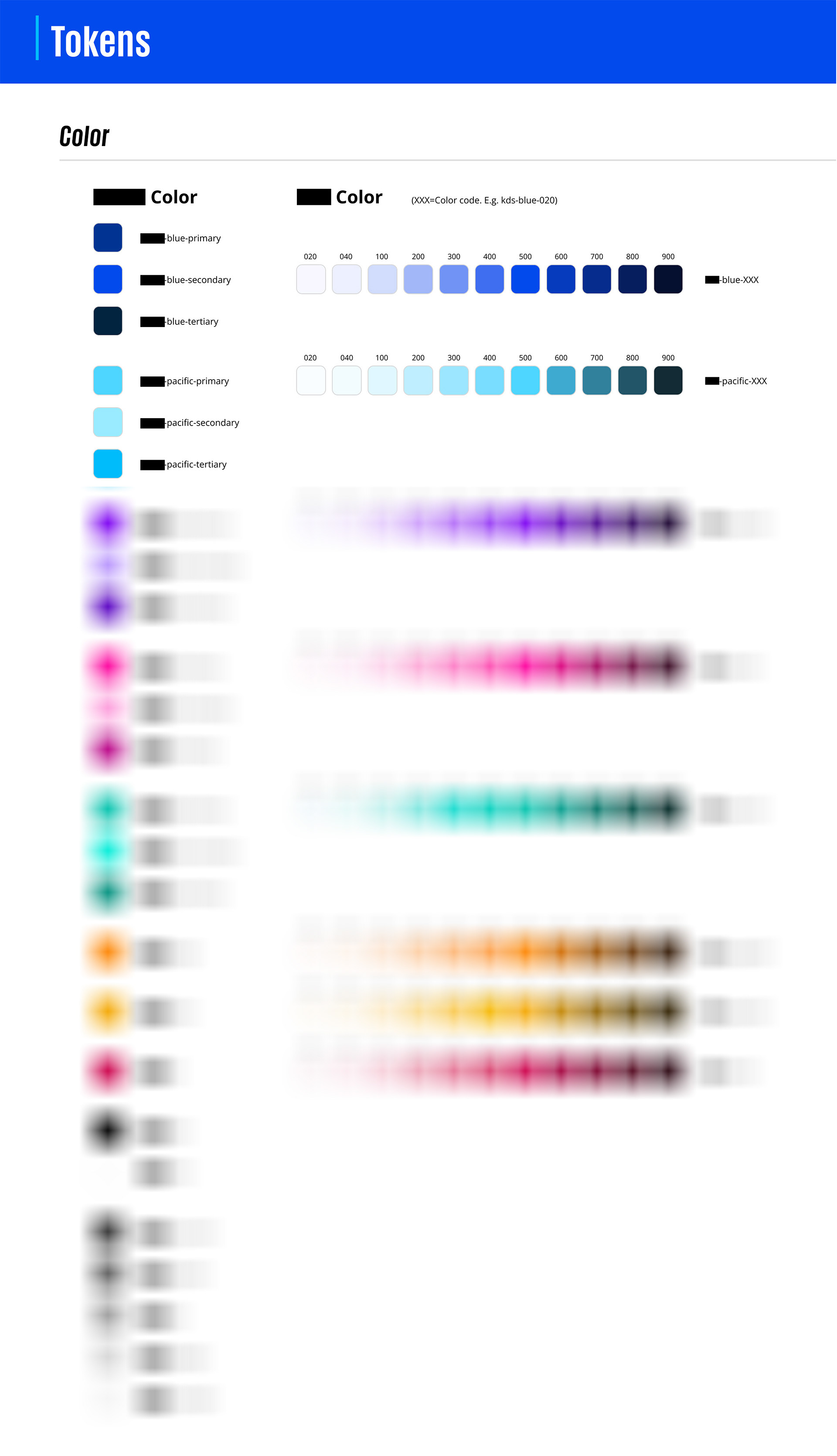
The color token system is categorized by primary, secondary, and tertiary shades for each color family, including blue, pacific, purple, pink, green, orange, yellow, red, black, white, and various grays. Each color is represented with multiple shades, marked by codes ranging from light (Q20) to dark (Q900). These colors correspond to the brand guidelines and have passed usability tests according to W3C color compliance, ensuring accessibility and readability across platforms.
カラー トークンシステムは、青、パシフィック、紫、ピンク、緑、オレンジ、黄色、赤、黒、白、いろんなグレーを含む各カラー ファミリーのプライマリー、セカンダリー、テリータリー シェードに色を分類してる。各色は複数のシェードで表されてて、ライト (Q20) からダーク (Q900) までのコードでマークされてる。これらの色はブランドガイドラインに対応してて、W3Cのカラコンプライアンスに基づくユーザビリティテストを通過してて、いろんなプラットフォームでのアクセシビリティと可読性を確保してる。
W3C color compliance
W3Cカラコンプライアンス
(Sample)
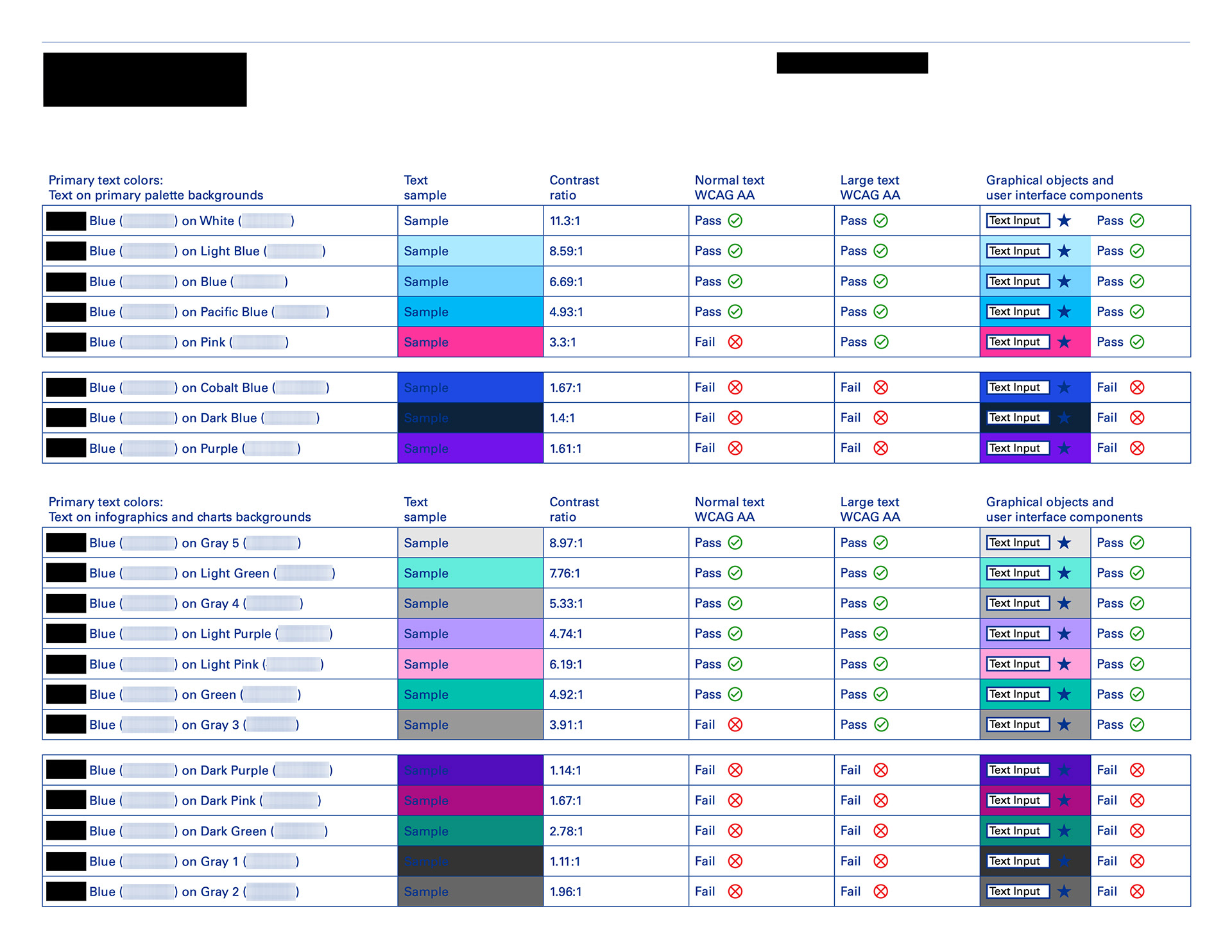
We have always considered usability while designing components; all the elements, including color tokens, in the KIT design system have passed text W3C color compliance. We have also conducted other examinations, such as contact and readability tests for text-related components on the second version of the design system demo.
コンポーネントをデザインする時、ずっとユーザビリティを考えてきた。KITデザインシステムのすべての要素、カラー トークンを含めて、テキストのW3Cカラコンプライアンスに合格してる。また、デザインシステムデモの第2版では、テキスト関連コンポーネントの接触テストや可読性テストなどの他の検査も行った。
The above content describes the parts I participated in creating in the first version of the Design System and has blurred the key data.
上記の内容は、Design Systemの第一バージョンで私が制作に参加した部分を説明しており、重要なデータはぼかされています。