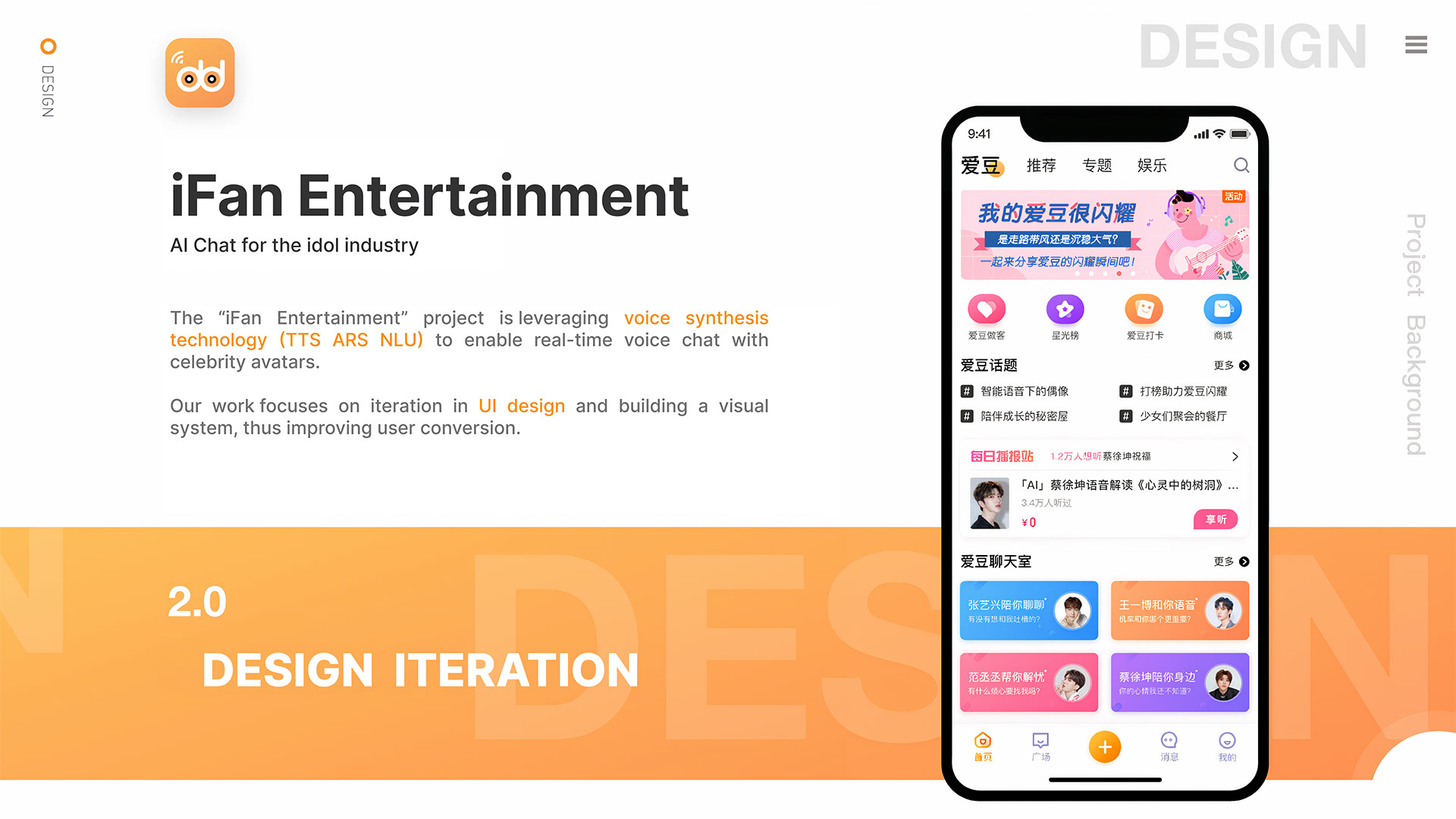
The “iFan Entertainment” project is leveraging voice synthesis technology (TTS ARS NLU) to enable real-time voice chat with celebrity avatars. Our work focuses on iteration in UI design and building a visual system, thus improving user conversion.
「iFan Entertainment」プロジェクトは、音声合成技術(TTS、ARS、NLU)を使って、セレブのアバターとのリアルタイム音声チャットを可能にしてる。私たちの作業は、UIデザインのイテレーションと視覚システムの構築に焦点を当てていて、ユーザーのコンバージョンを向上させてるんだ。
Project Affiliation: Baidu, Inc.
Role Description:
・Support the design and optimization of the main interface and navigation structure to ensure a user-friendly and seamless experience.
・Help create and maintain visual design guidelines, ensuring consistency in brand presentation across different product versions.
・Assist in designing and refining icons based on product needs to improve user recognition and align with the product's entertainment focus.
・Coordinate with product managers and developers to ensure that design solutions are implemented smoothly and align with technical requirements.
ロジェクト所属:Baidu, Inc.
役割説明:
・主要なインターフェースとナビゲーション構造のデザインと最適化をサポートし、ユーザーフレンドリーでシームレスな体験を確保する。
・視覚デザインガイドラインを作成および維持し、異なる製品バージョンでのブランドプレゼンテーションの一貫性を確保する。
・製品のニーズに基づいてアイコンのデザインと改良を支援し、ユーザーの認識を向上させ、製品のエンターテイメントの焦点に合わせる。
・製品マネージャーや開発者と調整し、デザインソリューションがスムーズに実装され、技術要件に合致するようにする。
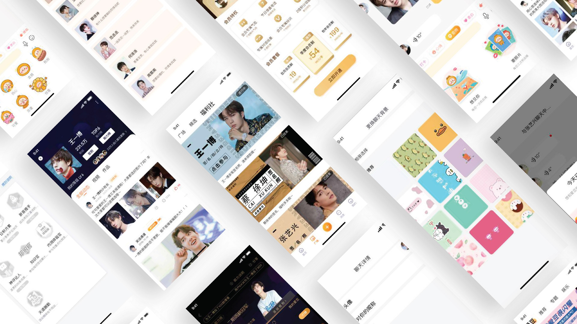
Home Screen Iteration
ホーム画面イテレーション
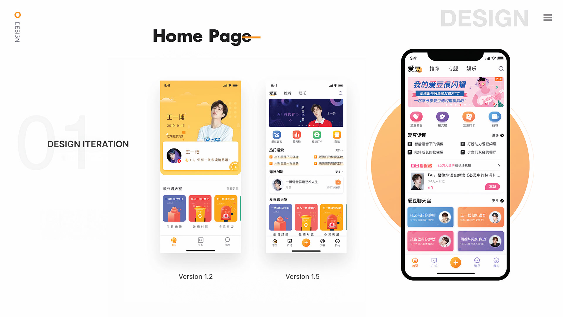
Version 1.2 features a simple yellow background with a clean layout centered around a celebrity’s image (王一博), designed for quick selection and iteration. The right side presents version 1.5, which introduces a more complex, colorful interface with distinct topics, recommendations, and entertainment sections.
バージョン1.2はシンプルな黄色の背景と、セレブの画像(王一博)を中心にしたクリーンなレイアウトが特徴で、迅速な選択とイテレーションが可能なデザインになっている。一方、右側のバージョン1.5は、より複雑でカラフルなインターフェースを導入し、明確なトピック、推奨、およびエンターテイメントセクションを提供している。
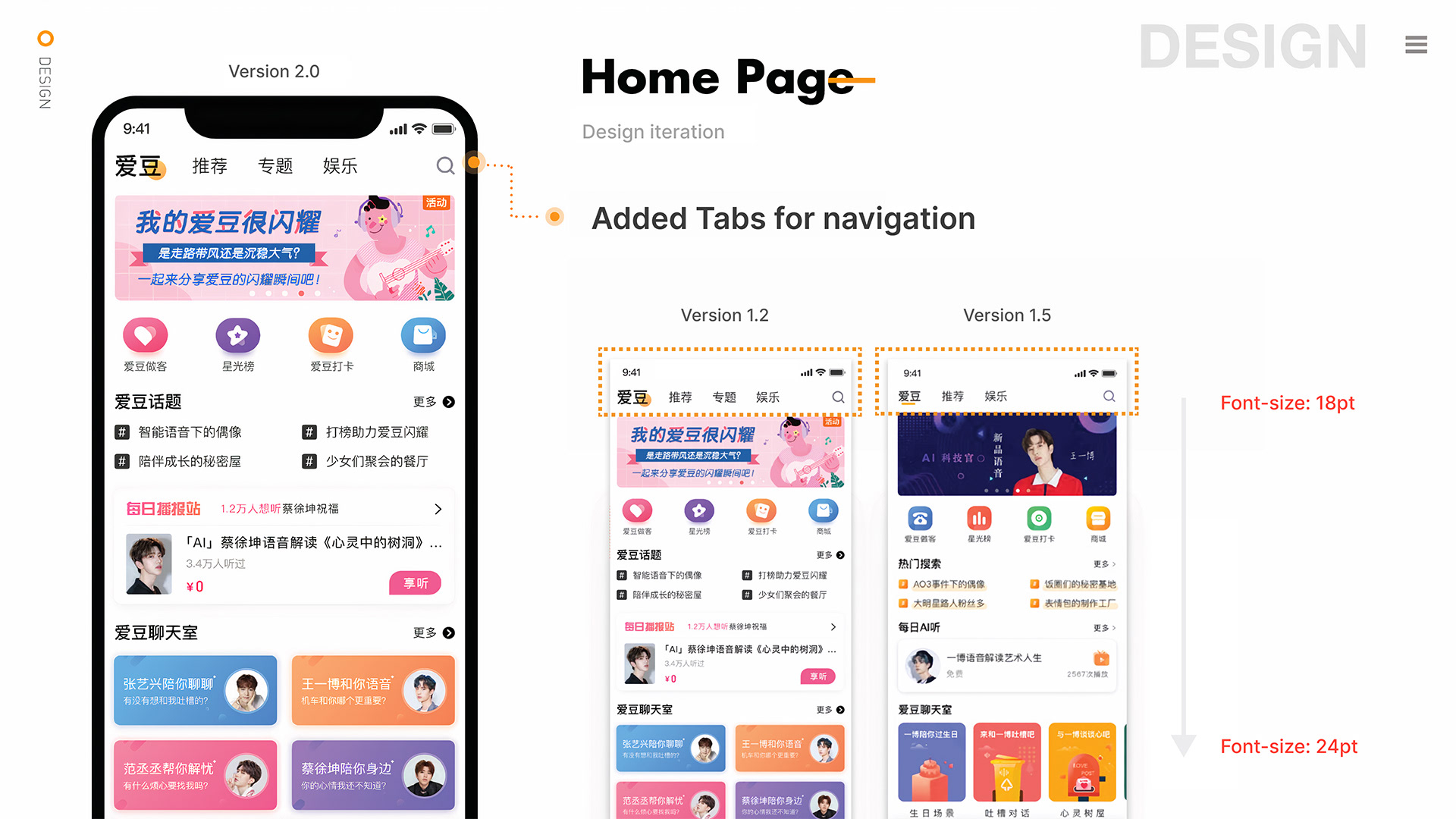
The APP V2.0 Home Page introduces new tab labels and a themed section, allowing users to browse celebrity news more easily and improving content visibility. The tab bar now highlights the “Theme” section with a circle dot indicator to show the current selection. The font size has been increased from 18pt to 24pt for better readability and visual clarity, enhancing the overall user experience.
APP V2.0のホームページでは、新しいタブラベルとテーマセクションが導入され、ユーザーがセレブのニュースをより簡単に閲覧できるようになり、コンテンツの可視性が向上している。タブバーは、現在の選択を示すために「テーマ」セクションを丸いドットインジケーターで強調している。また、フォントサイズが18ptから24ptに増やされ、読みやすさと視覚的な明瞭さが向上し、全体的なユーザー体験が改善されている。
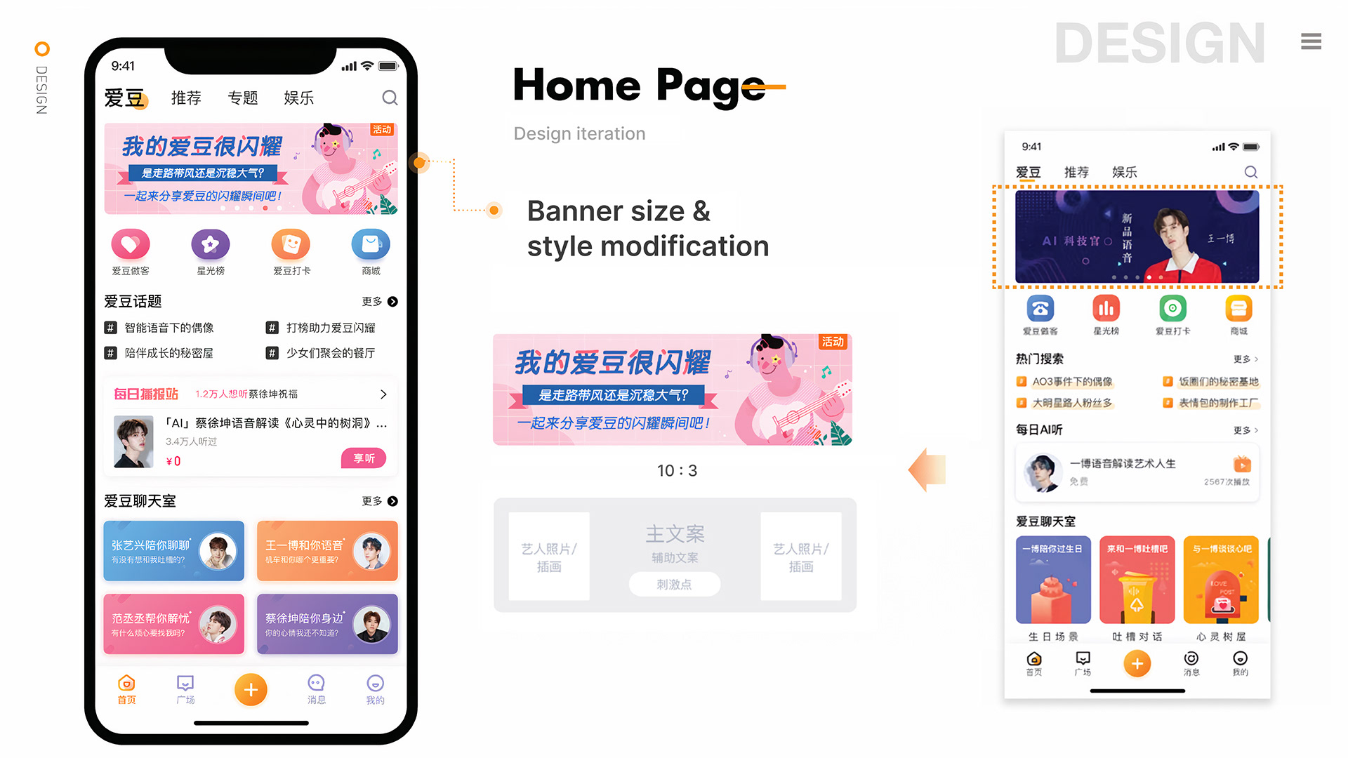
The banner design guidelines for version 2.0 of the app focus on standardizing size, content, and layout for consistency and effectiveness. The banner size is 430x130 (750x1334 standard) and features key themes or events with images centered on celebrity upper-body shots. The color scheme should match the app’s youthful and vibrant design. The guidelines emphasize a 6:4 image-to-text ratio, placing important information on the left to align with users’ reading habits and using engaging visuals to attract attention during significant events. This creates a unified standard for commercial promotions and celebrity-related content.
アプリのバージョン2.0のバナーデザインガイドラインは、一貫性と効果を確保するためにサイズ、コンテンツ、レイアウトの標準化に焦点を当てている。バナーのサイズは430x130(750x1334の標準)で、セレブの上半身ショットを中心にした主要なテーマやイベントを特徴としている。カラースキームはアプリの若々しく活気のあるデザインに合わせるべきだ。ガイドラインは6:4の画像対テキスト比を強調し、重要な情報を左側に配置してユーザーの読み習慣に合わせ、重要なイベントの際に視覚的に魅力を引きつけることを目的としている。これにより、商業プロモーションやセレブ関連コンテンツのための統一された基準が確立される。
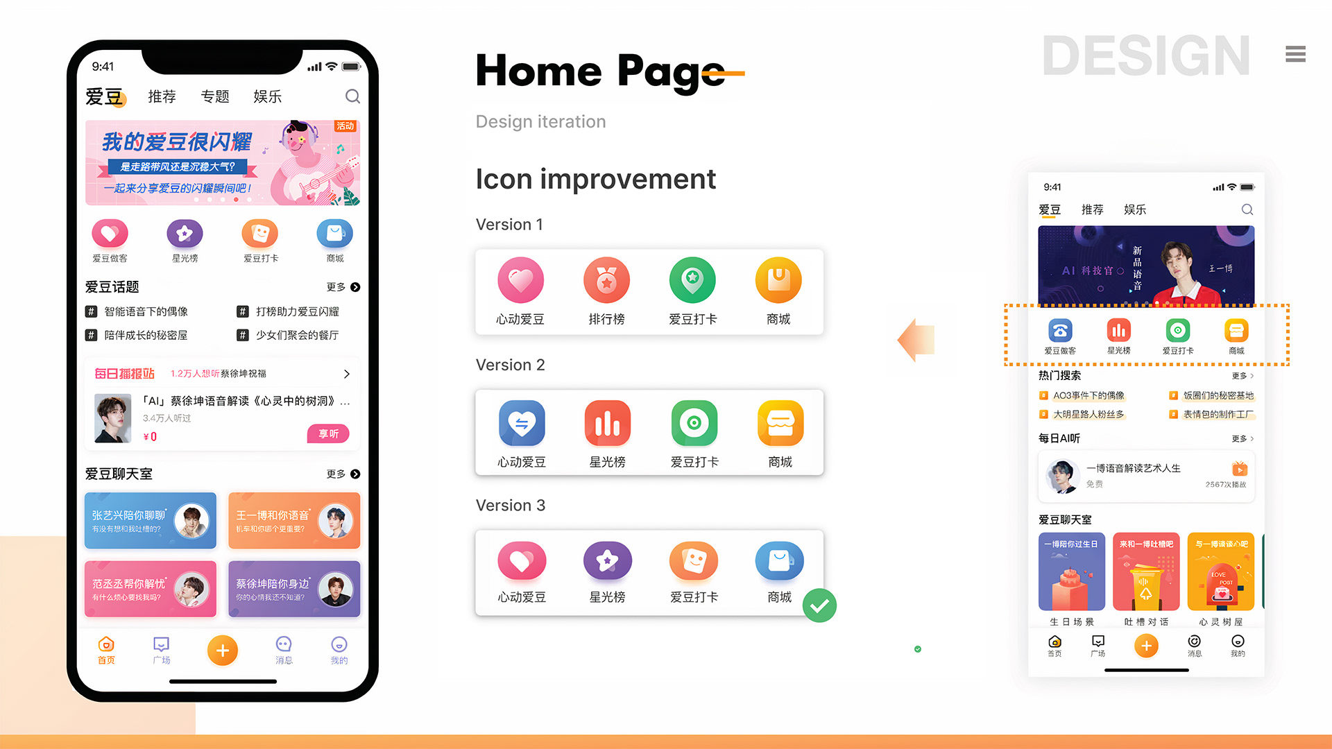
The previous icons were not distinct, lacked entertainment value, and were hard for users to recognize. In the version 2.0 update, three design iterations were explored, with the third version being chosen. The new icons are more playful and recognizable, improving user experience and reflecting the app’s branding better. The third version features a balanced layout and appealing colors, making functionality clearer for users.
前のアイコンは特徴がなく、エンターテイメント性に欠けていて、ユーザーが認識するのが難しかった。バージョン2.0のアップデートでは、3つのデザインのイテレーションが検討され、3番目のバージョンが選ばれた。新しいアイコンはより遊び心があり、認識しやすくなって、ユーザー体験が向上し、アプリのブランディングをより反映している。3番目のバージョンはバランスの取れたレイアウトと魅力的な色合いを特徴としており、ユーザーにとって機能がより明確になっている。
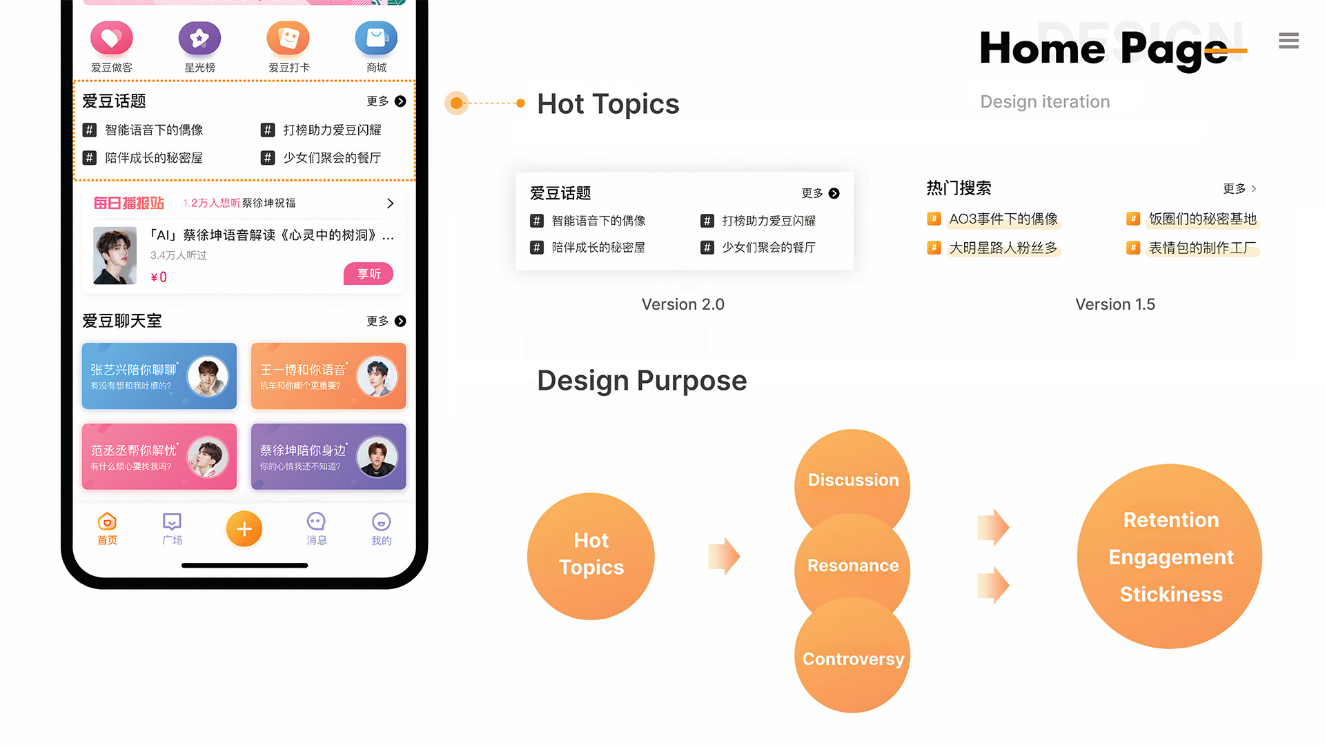
In the updated version, the layout was improved for a more cohesive and engaging experience by reducing gaps between blocks and increasing content density for easier browsing. The product team worked on aligning the blocks to make topics more visually appealing and accessible. The Hot Topics Engagement Flow shows how discussions attract users, increase visibility, and create controversy, fostering unique user-generated content (UGC) and boosting participation and engagement, which enhances user loyalty. The redesign aims to make the app more interactive and engaging.
更新版では、ブロック間の隙間を減らし、コンテンツ密度を高めることで、より統一感のある魅力的な体験を提供するためにレイアウトが改善された。プロダクトチームは、ブロックの整列に取り組み、トピックを視覚的に魅力的でアクセスしやすくした。「ホットトピックエンゲージメントフロー」は、ディスカッションがどのようにユーザーを引き付け、可視性を高め、論争を生むかを示しており、ユニークなユーザー生成コンテンツ(UGC)を育て、参加を強化し、全体的なエンゲージメントを高め、最終的にユーザーの忠誠心を高める。リデザインは、アプリをよりインタラクティブで魅力的にすることを目指している。
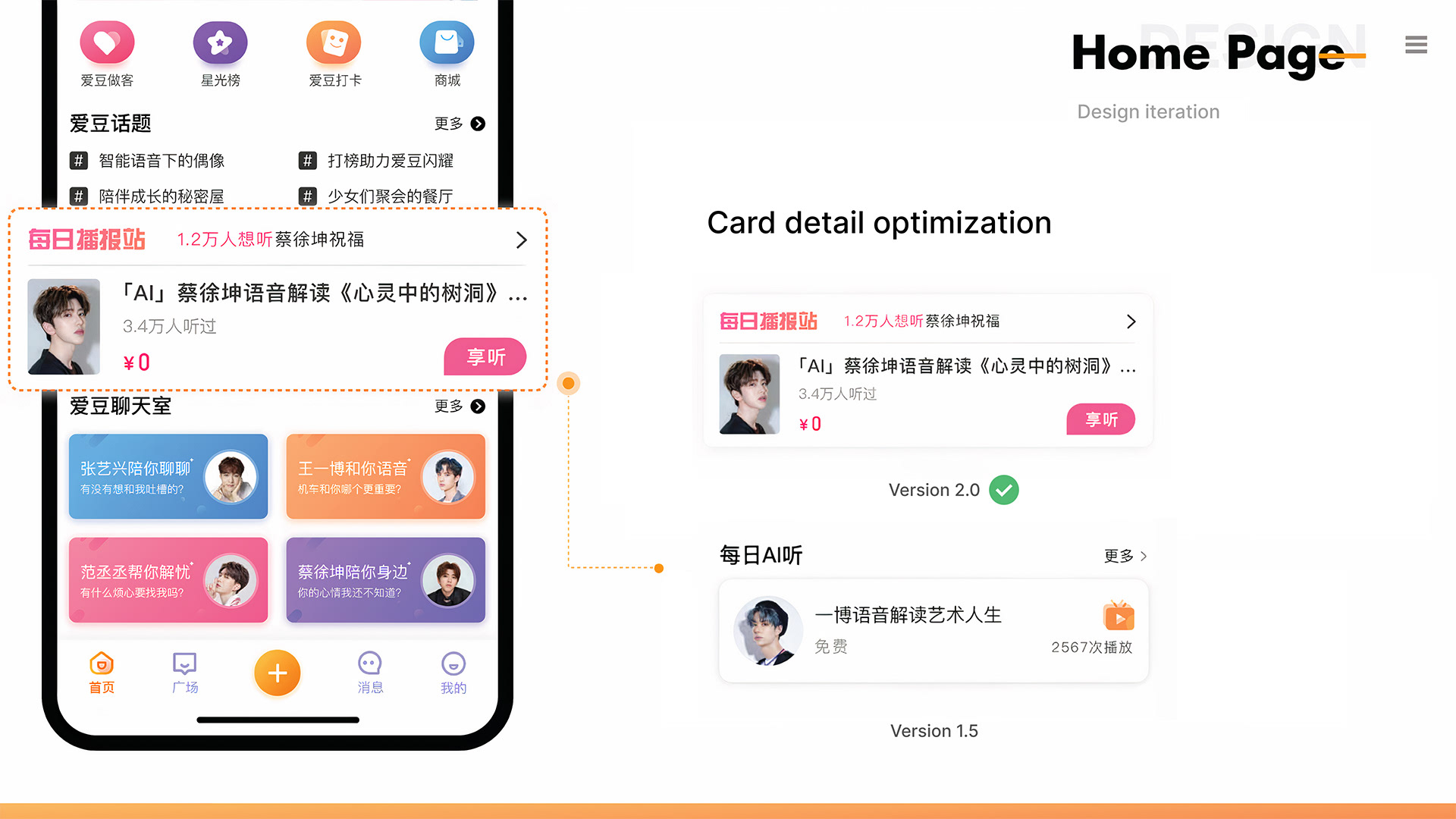
The updated version aims to attract new users by offering free listening products with various celebrities. It encourages interaction through “listen” buttons, enhancing engagement with the content. Design changes were made to the title order and subject lines for clarity and trust, renaming it to “每日播报站” (Daily Broadcast Station) to reduce distrust related to “AI.” Other improvements include clearer call-to-action buttons, better text alignment, and subtle visual guidance to enhance the listening experience. These updates aim to increase clicks on featured items and provide a more trustworthy and visually appealing interface.
更新されたバージョンは、さまざまなセレブとの無料リスニング商品を提供することで新しいユーザーを引き付けることを目的としている。「リスン」ボタンを通じてインタラクションを促し、コンテンツへのエンゲージメントを高める。デザインの変更では、タイトルの順序や件名を調整して明確さと信頼を提供し、「AI」の強調を減らすためにタイトルを「每日播报站」(デイリーブロードキャストステーション)に変更した。他の改善点には、より明確なコールトゥアクションボタン、テキストの整列、リスニング体験を向上させるための微妙な視覚的ガイダンスが含まれている。これらの更新は、特集アイテムのクリック数を増やし、より信頼性が高く視覚的に魅力的なインターフェースを提供することを目指している。
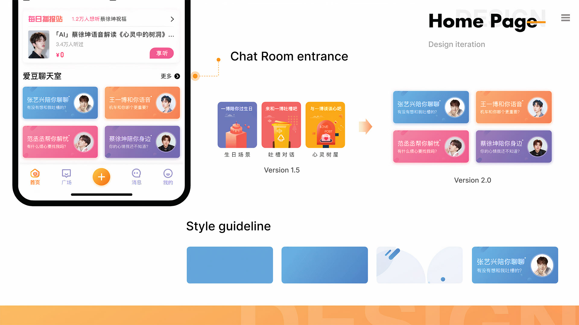
The new version improves visual readability with vibrant colors like blue, green, and orange, matching the app’s theme. The updated card layout offers clearer content separation and distinct styles, keeping up with modern trends. Each card is better divided, enhancing visual hierarchy and making navigation easier in the chatroom. The design also uses a gradient color scheme and soft shadows for a more modern and appealing interface.
新しいバージョンは、アプリのテーマに合わせた鮮やかな青、緑、オレンジの色を取り入れることで視覚的な読みやすさを向上させている。更新されたカードレイアウトは、コンテンツの明確な分離と独自のスタイルを提供し、現代的なトレンドに合わせている。各カードはより明確に分割され、視覚的な階層が向上し、チャットルーム内でのナビゲーションが容易になっている。また、デザインはグラデーションのカラースキームと柔らかい影を使用して、より現代的で魅力的なインターフェースを実現している。
Chat Page Iteration
チャットページイテレーション
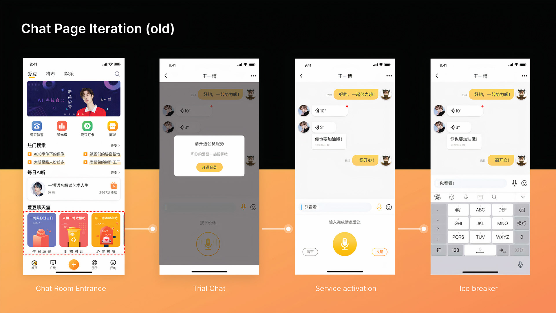
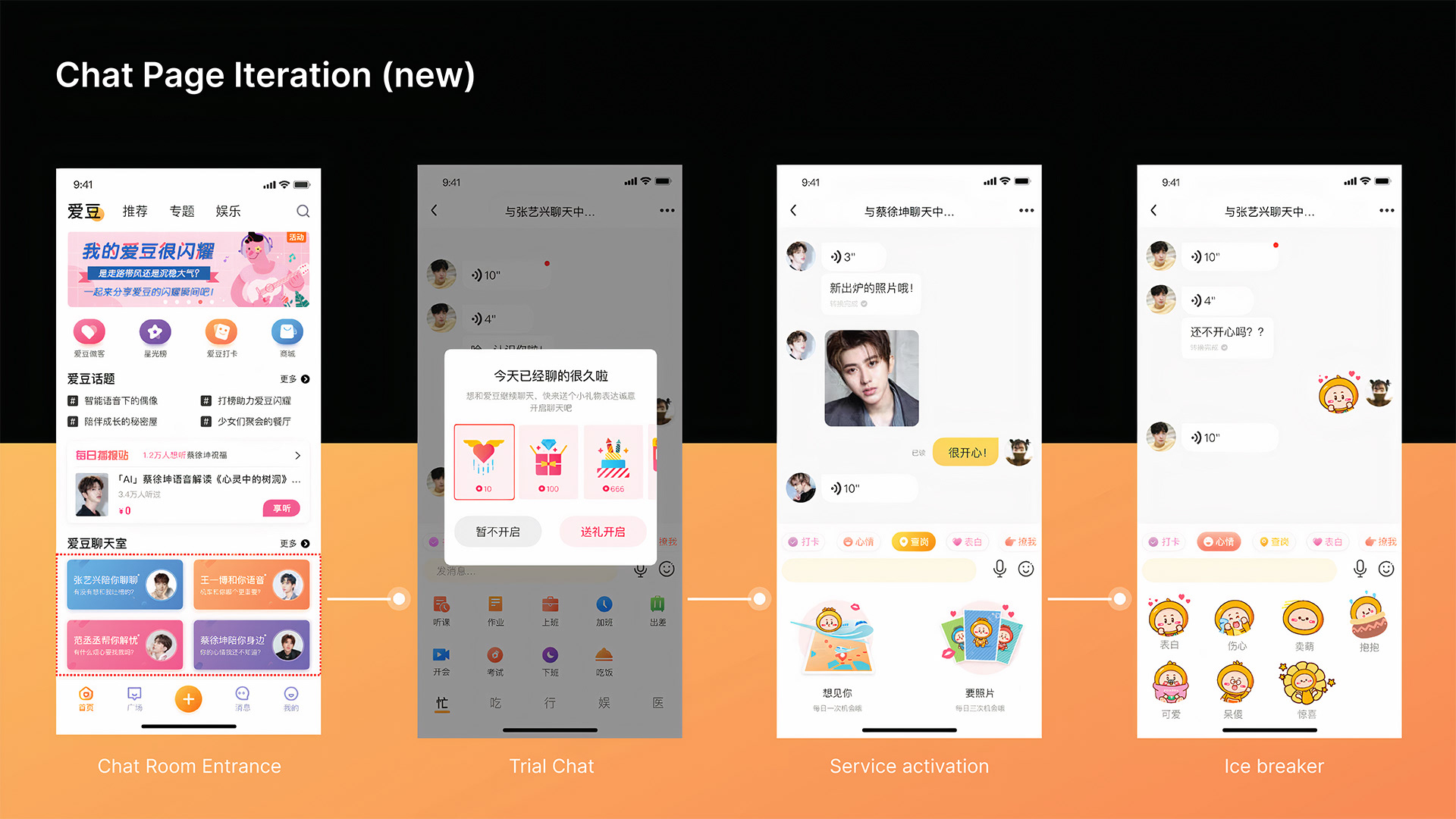
In the old version, users accessed the chat from the home page and were prompted to try a membership service for more features, along with basic text and speech-to-text support. The new version enhances visual appeal with brighter icons and adds engaging features like virtual gifts and random chats with celebrities. It also personalizes the chat experience with media sharing, such as celebrity photos and emotional sticker packs, allowing users to express their feelings visually. These updates make the chat more interactive and enjoyable.
旧バージョンでは、ユーザーはホームページからチャットにアクセスし、より多くの機能を得るためにメンバーシップサービスを試すよう促され、基本的なテキストや音声認識サポートが提供されていた。新バージョンでは、明るいアイコンで視覚的な魅力が向上し、バーチャルギフトやセレブとのランダムチャットなどの魅力的な機能が追加されている。また、メディア共有(セレブの写真や感情を表現するステッカーセット)を取り入れることで、チャット体験が個別化され、ユーザーが感情を視覚的に表現できるようになった。これらの更新により、チャットがよりインタラクティブで楽しいものになっている。
Fan Community Improvements
ファンコミュニティの改善
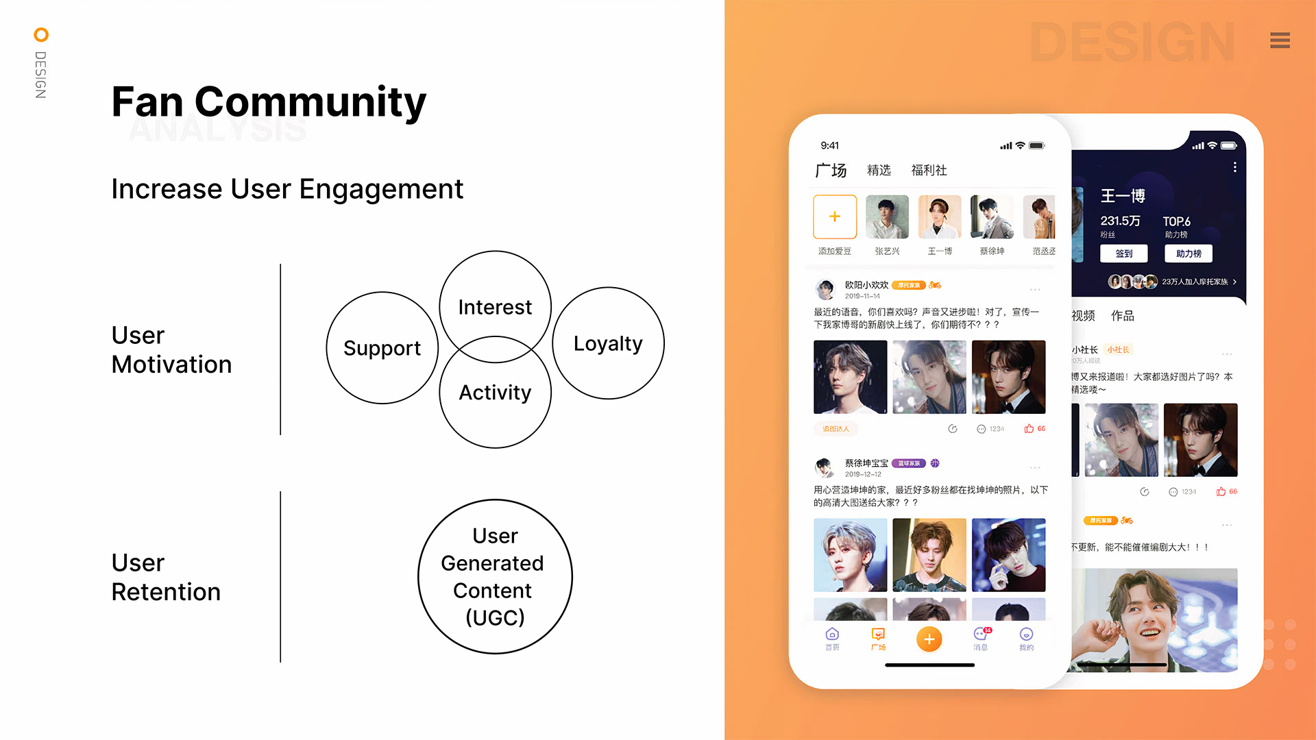
Each celebrity has a dedicated fan group in the app, organized to attract and keep loyal fans. It combines user-generated content (UGC) activities with events, allowing fans to engage in tasks, check-ins, and discussions about their favorite celebrities. This encourages trending topics and deeper interactions, enhancing loyalty to the product. The platform focuses on motivation through interests and participation, aiming to maintain ongoing UGC creation and improve user retention, ultimately increasing the product’s value.
各セレブには、アプリ内に専用のファングループがあり、忠実なファンを集めるために整理されたシステムで構成されている。ユーザー生成コンテンツ(UGC)活動とイベントを統合し、ファンが好きなセレブに関するタスク、チェックイン、ディスカッションに参加できるようになっている。これにより、トレンドの話題や深いインタラクションが生まれ、製品への忠誠心が強化される。このプラットフォームは、興味や参加を通じてモチベーションを重視し、継続的なUGCの創出を維持してユーザーの定着を向上させ、最終的には製品の価値を高めることを目指している。
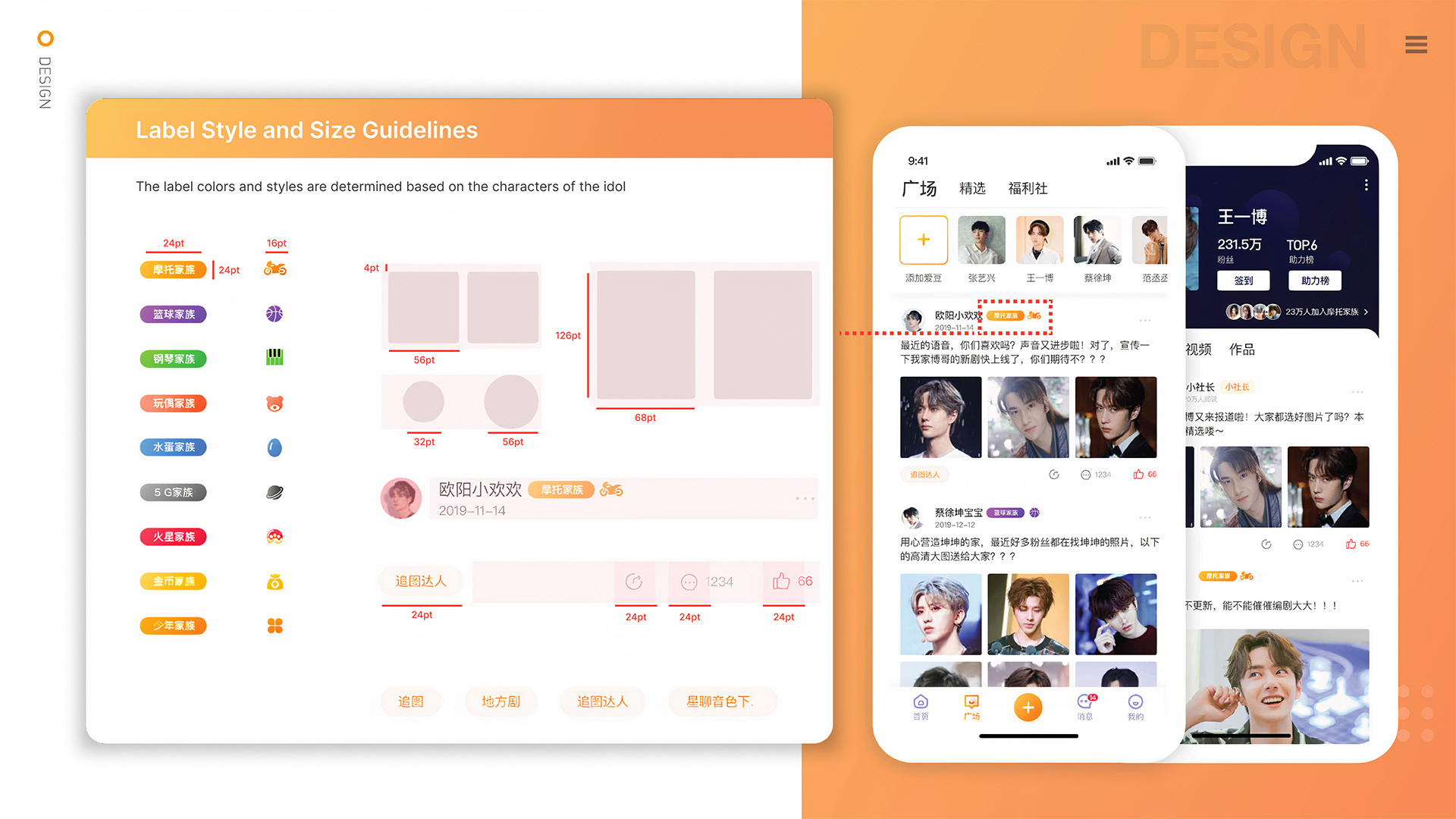
This page outlines the style and guidelines for the celebrity activity component, including label styles, sizes, and color systems based on celebrity roles and favorites. Font sizes vary (e.g., 24pt), and image sizes are standardized: rectangular images are 88pt and 56pt, while circular images are 56pt and 32pt. User interaction features like “Follow Celebrity” and “Like” have uniform sizes and styles to maintain a consistent interface.
このページでは、セレブ活動コンポーネントのスタイルとガイドラインを説明していて、ラベルのスタイルやサイズ、セレブの役割や好みに基づいたカラーペアリングが含まれてる。フォントサイズは異なっていて(例:24pt)、画像サイズは標準化されてる:長方形の画像は88ptと56pt、円形の画像は56ptと32ptだ。「フォロー」や「いいね」といったユーザーインタラクション機能は、均一なサイズとスタイルを持っていて、一貫したインターフェースを保つために設計されてる。
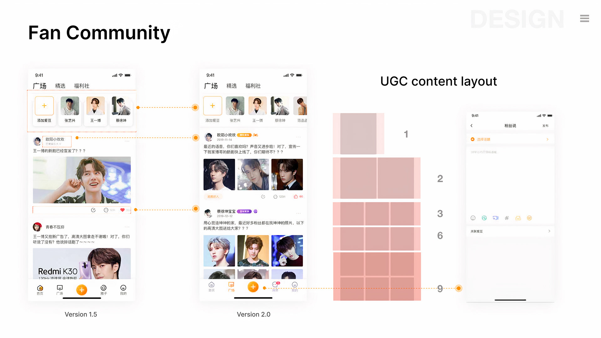
In Version 2.0, we made important updates by removing shadows and reducing the size of header cards to make horizontal scrolling quicker. We added identity circle tags to improve user engagement, which was lacking in the previous version. We also adjusted the design for consistent icon styles, like the “like” button. The image upload layout was improved to allow users to upload between 1 and 9 images, creating a more dynamic and organized content presentation.
バージョン2.0では、重要な更新を行い、影を取り除き、ヘッダーカードのサイズを縮小して横スクロールを速くしたよ。ユーザーエンゲージメントが低かった前のバージョンを改善するために、アイデンティティサークルタグを追加した。さらに、「いいね」ボタンなどのアイコンスタイルを一貫させるためにデザインを調整した。画像アップロードのレイアウトも改善され、ユーザーが1〜9枚の画像をアップロードできるようになり、よりダイナミックで整理されたコンテンツ表示が可能になったんだ。
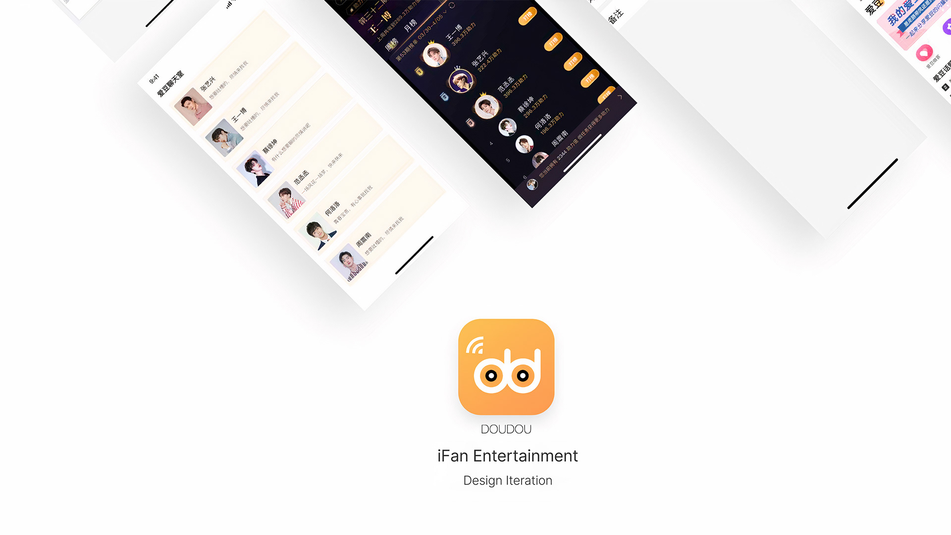
Visual Improvement of the Support Ranking
助力榜の視覚改善
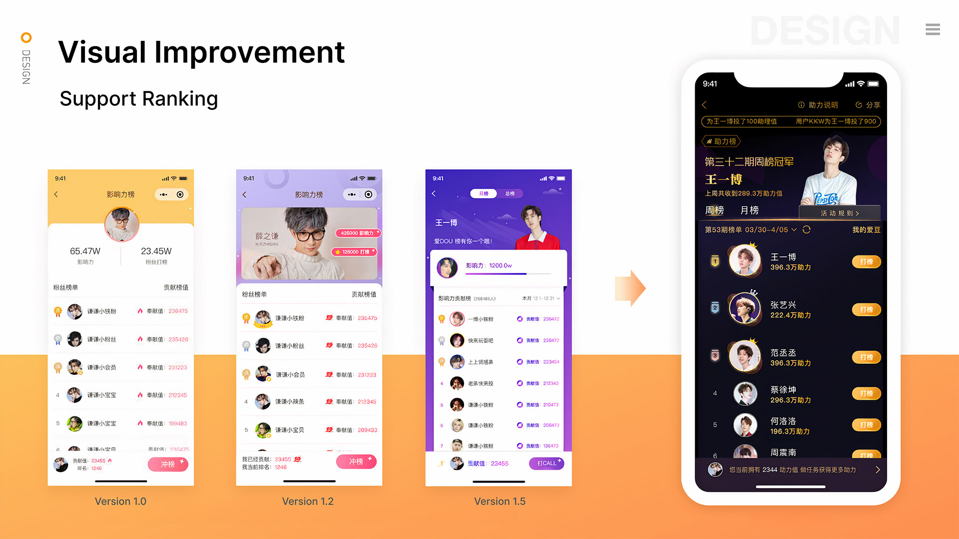
The changes we made for the support ranking system include strengthening color contrast to create a more immersive and engaging visual atmosphere, improving flow clarity to help users track rankings more easily, and enhancing the sense of pride and accomplishment by highlighting user achievements with vibrant colors and intuitive navigation.
サポートランキングシステムの変更では、より没入感のある魅力的なビジュアル環境を作るために色のコントラストを強化して、ユーザーがランキングを簡単に追跡できるようにフローの明確さを改善したり、鮮やかな色と直感的なナビゲーションでユーザーの成果を強調して誇りと達成感を高めてるんだ。
Visual Improvements for the Task Center
タスクセンターの視覚改善
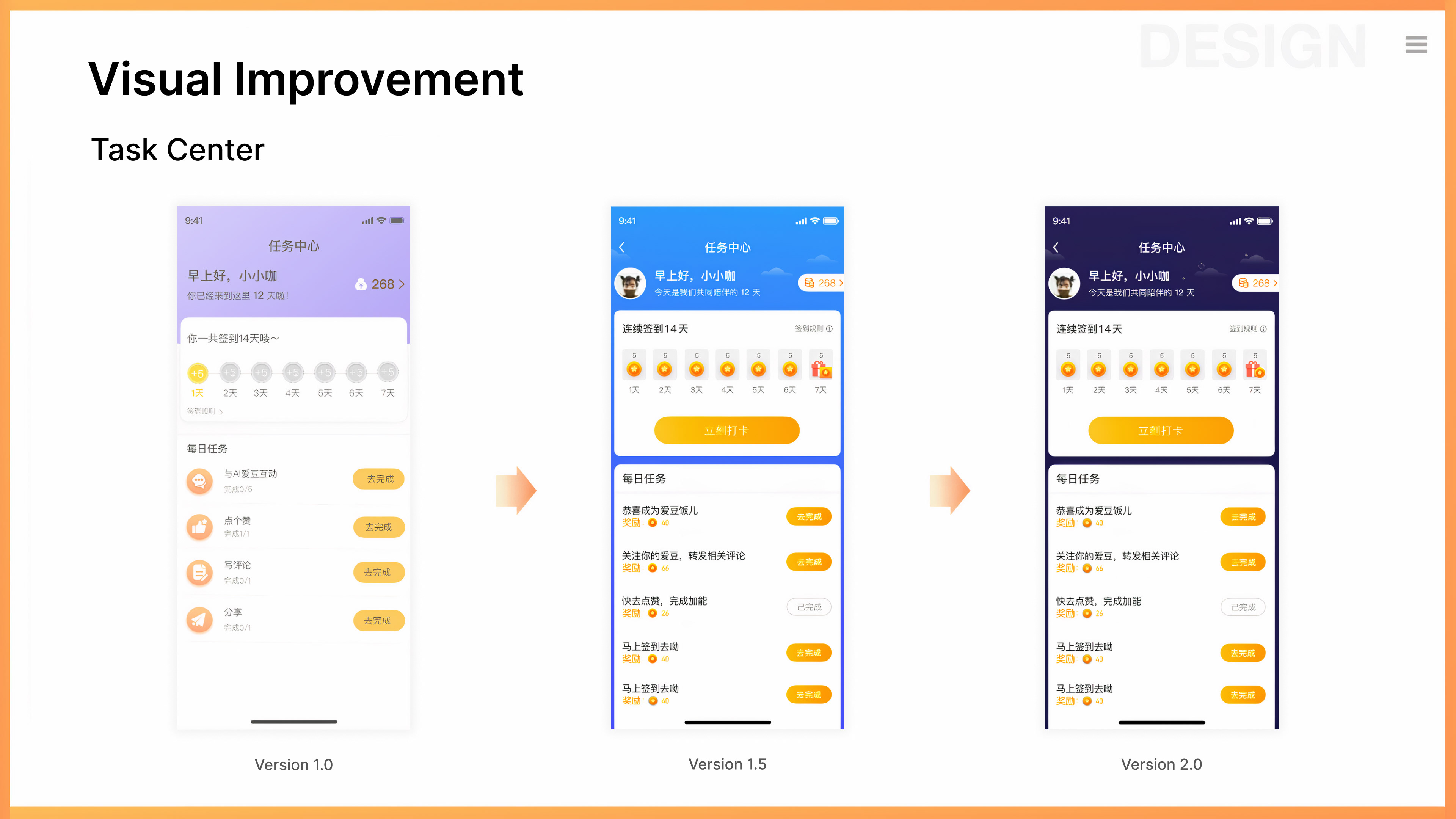
The task center module underwent fundamental changes from version 1.0 to 1.5, including a refined color scheme to improve visual appeal and user engagement. User research showed that most users engage with the product between 8:00 and 12:00, creating day and night modes. The daytime mode has a blue background with complementary blue and orange colors, using orange to enhance contrast. The new interface also improves space utilization in the cards, creating a visual difference that highlights the task center’s atmosphere.
タスクセンターモジュールは、バージョン1.0から1.5にかけて大きな変更があって、視覚的な魅力とユーザーエンゲージメントを向上させるために色の配色が洗練された。ユーザーリサーチによると、ほとんどのユーザーは8:00〜12:00の時間帯に製品を使ってるから、昼と夜のモードが作られた。昼間のモードは青い背景で、青とオレンジの補色を使っていて、オレンジ色でコントラストを強化してる。新しいインターフェースはカードのスペースの利用効率も改善されて、タスクセンターの雰囲気を強調する視覚的な違いを生み出してる。
Task Center Flow Optimization
タスクセンターのフロー最適化

In Version 2.0 of the task center page, we focused on reducing the steps needed to complete tasks, which minimizes user actions and improves efficiency. Users can now interact directly from the current page without unnecessary transitions. For example, daily sign-ins are completed seamlessly within the interface, with pop-up confirmations and a simpler task center shown on the same page. These changes make interactions easier and enhance the overall user experience.
タスクセンターページのバージョン2.0では、タスクを完了するためのステップを減らすことに焦点を当てて、ユーザーの操作を最小限にし、効率を向上させたよ。ユーザーは、不要な遷移なしに現在のページから直接インタラクションできるようになった。例えば、毎日のサインインは、インターフェース内でシームレスに完了し、ポップアップ確認やよりシンプルなタスクセンターが同じページに表示されるようになってる。この変更で、インタラクションが簡単になり、全体的なユーザー体験が向上するんだ。